
Are you an aspiring trader trying to make sense of the extremely volatile trading markets? If so, you may want to consider learning the basics of technical analysis — the art of reading price charts. But getting started can be tricky. Timeframes, chart patterns, indicators, support & resistance lines, and more — the world of technical analysis is vast and varied. Yet, there is a secret resource that, if mastered, can give you an edge over other traders. Introducing: candlestick patterns.
Candlesticks are highly resourceful chart-specific entities. The body, wick, color, and positioning can readily reveal the condition of the concerned asset in the fewest possible words. And even though a standalone candlestick is loaded with insights regarding the asset’s opening price, closing price, highest price, lowest price, and other period-specific insights, candlestick patterns are superior. They help identify chances of trend continuation, trend reversal, consolidation, breakouts, and more.
Want to ask a PRO trader a question on technical analysis ? Join BeInCrypto Trading Community on Telegram: discuss crypto, watch Trading Basics course & ask and get answers to all your questions from PRO traders & experts! Join now
- The reversal candle pattern: what is it, and how does it work?
- Key differences between bullish and bearish reversal candlestick patterns
- Ways to identify reversal candle patterns
- Bullish reversal candlesticks: top ones explained
- Bearish reversal candlesticks: top ones explained
- Are all reversal candlestick patterns reliable?
- Candlesticks patterns and indicators are a winning combination
- Frequently asked questions
The reversal candle pattern: what is it, and how does it work?

A reversal candle pattern is a type of candlestick grouping or positioning that tells us that the current price change might try and change direction. A reversal candle pattern is no different from a standard structure. It’s the candle grouping and pattern formation that’s different. And a reversal pattern, per the name, can bring out a bullish and even a bearish reversal.
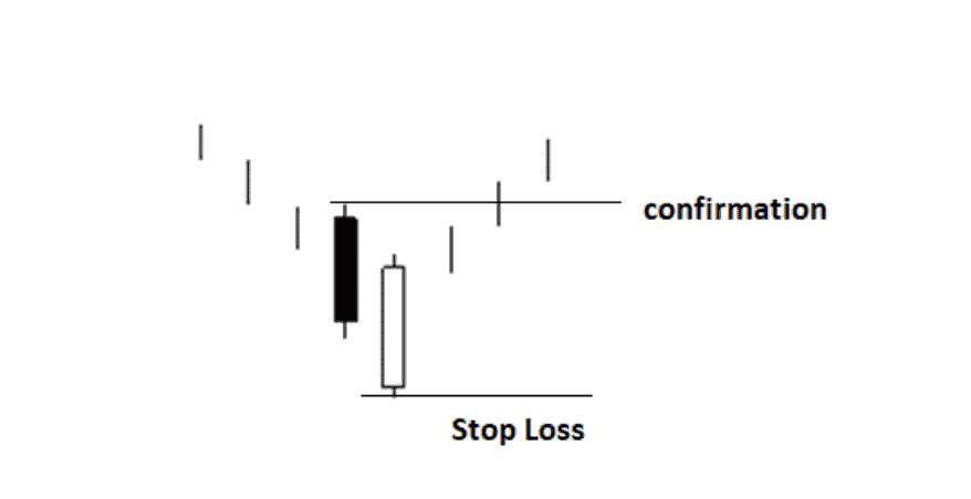
Candlesticks are the building blocks of a price chart. The below image may come in handy as we delve deeper into the concept of candlestick patterns:
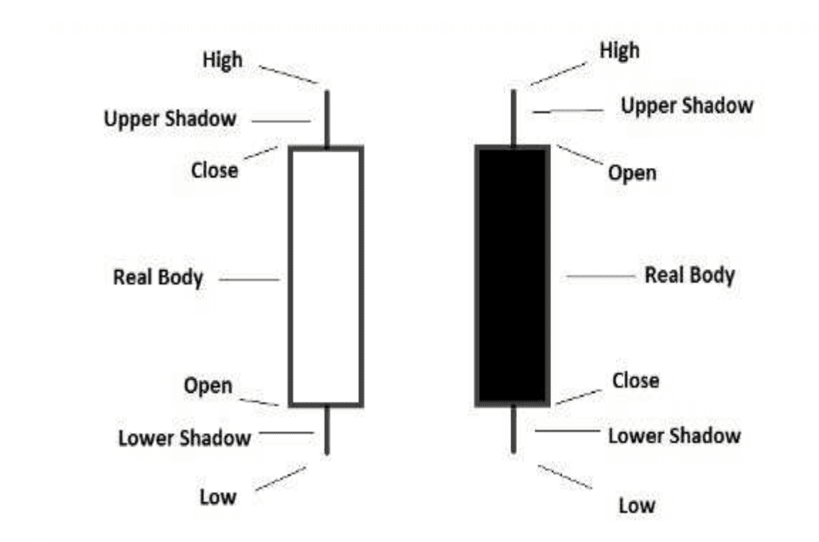
In the case of a bullish (green) candle, the lower edge of the body is the opening price, whereas the upper edge is the closing price. The lowermost wick (if there) is appropriately the lowest price (in the given period), whereas the upper wick (if there) is appropriately the highest price (in the given period).
For a bearish (red) candle, the upper edge of the body is the opening price, the upper wick is the highest price (in the given period), the lower wick is the lowest price (in the given period), and the lower edge of the body is the closing price.
Circling back to our definition, a reversal candle pattern uses candlestick-specific insights (mentioned above) and helps traders identify key trend reversal scenarios on the price chart. Also, candlestick reversals come in many forms, but they are broadly segregated as bullish and bearish candlestick reversals.
The bullish ones usually show up during a bearish trend, hinting at a possible change of scenery for a beaten-down asset. Similarly, the bearish ones show up when the asset (market) is in an uptrend — hinting at some consolidation or even correction.
Key differences between bullish and bearish reversal candlestick patterns
One set of patterns hints at a possible surge in prices after extended an extended spell of dips, whereas the other set hints at a possible dip after a steady price rise.
Here are some of the other elementary differences:
| Parameter(s) | | Bullish candlestick pattern | | Bearish candlestick pattern |
| Market sentiment | Sellers might be losing strength | Buyers might be losing strength |
| Appearance | Comprises candlestick formations with long lower wicks | Comprises candlestick formations with long, higher wicks |
| Price action | It might hint at an upcoming rally | It might hint at an imminent correction |
| Examples | Bullish engulfing, morning star | Shooting star, hanging man, etc. |
Ways to identify reversal candle patterns
Here are some of the quick strategies to identify the supposed formation of a reversal candlestick pattern.
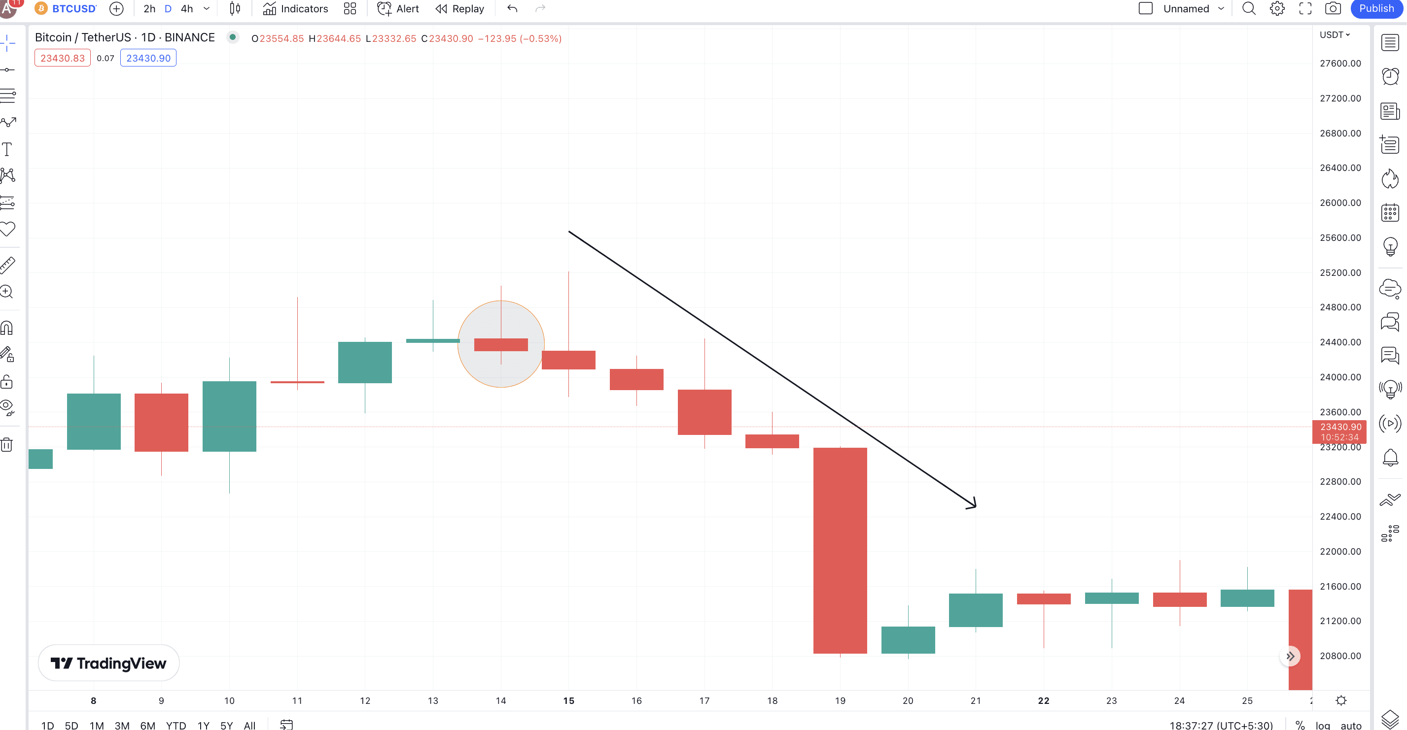
Check for a weakening trend
By now, we know that reversal candlestick patterns are meant to trigger trend changes. A good way to supplement or even predict their formation is to see if the asset is in a downtrend or an uptrend. As confirming measures, you can look for lower lows (in a downtrend) and higher highs (in an uptrend).
Now that you have a trend in sight check whether the volumes are reducing. If you see the trading volumes dropping amid an up/down trend, you might be on the lookout for a reversal candlestick pattern to further the assumption of an incoming change in price action.
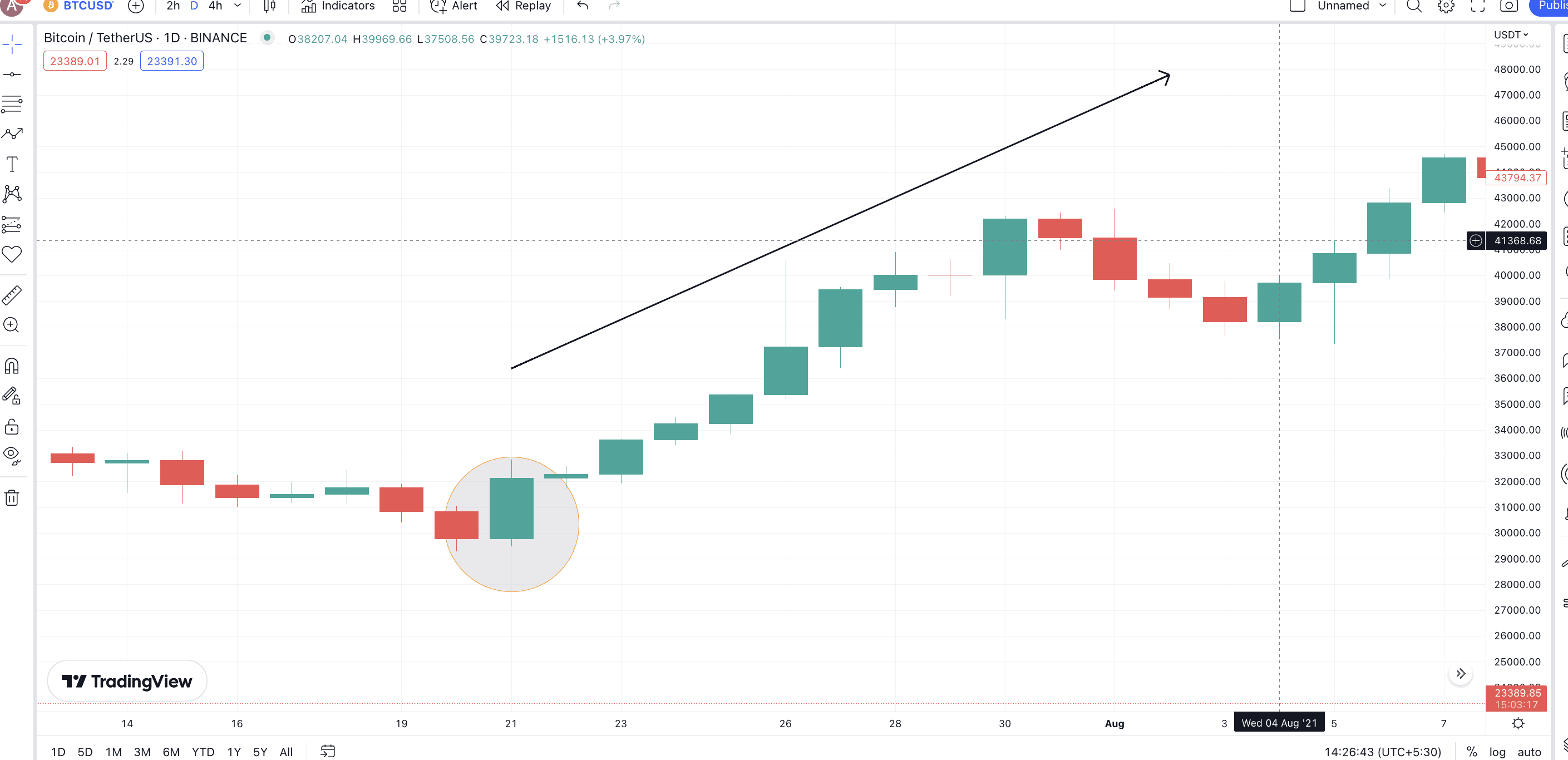
Here is an example:
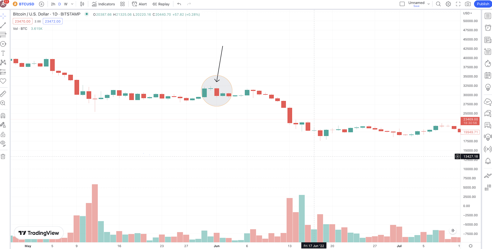
Notice how the price of BTC started experiencing lower volumes at $31K. The encircled zone shows a bearish reversal candle pattern or the evening Doji starts candlestick formation. Post this, the prices dropped significantly.
Keep an eye out for long candlesticks
Most candlestick patterns make long bodies and wicks, showing ongoing tussles between buyers and sellers. Reversal candle patterns usually surface when such long candles follow a trend.
Look for Dojis and Spinning Top formations
Doji candles stand for uncertain spells where there isn’t much difference between an asset’s opening price and closing price. These are almost body-less candles and appear whenever a reversal pattern might be in the works. As a Doji candle marks market indecision, it appears at the peak or bottom of a trend by driving new reversal candlestick patterns.
Apart from Doji, even Spinning top formations at the peak, bottom, or respective patterns can indicate a reversal.
Chart out crucial support and resistance levels
Most reversal candle patterns appear closer to the support and resistance levels. Marking them on a candlestick start beforehand is therefore advisable if you want to identify reversal candles clearly.
Use momentum indicators for preemption
Momentum indicators like the Relative Strength Index (RSI) and Moving Average Convergence/Divergence (MACD) are great for picking the weakening trend strength. Once the trend starts weakening, you can wait for the formatting of reversal candles to get a confirmation.
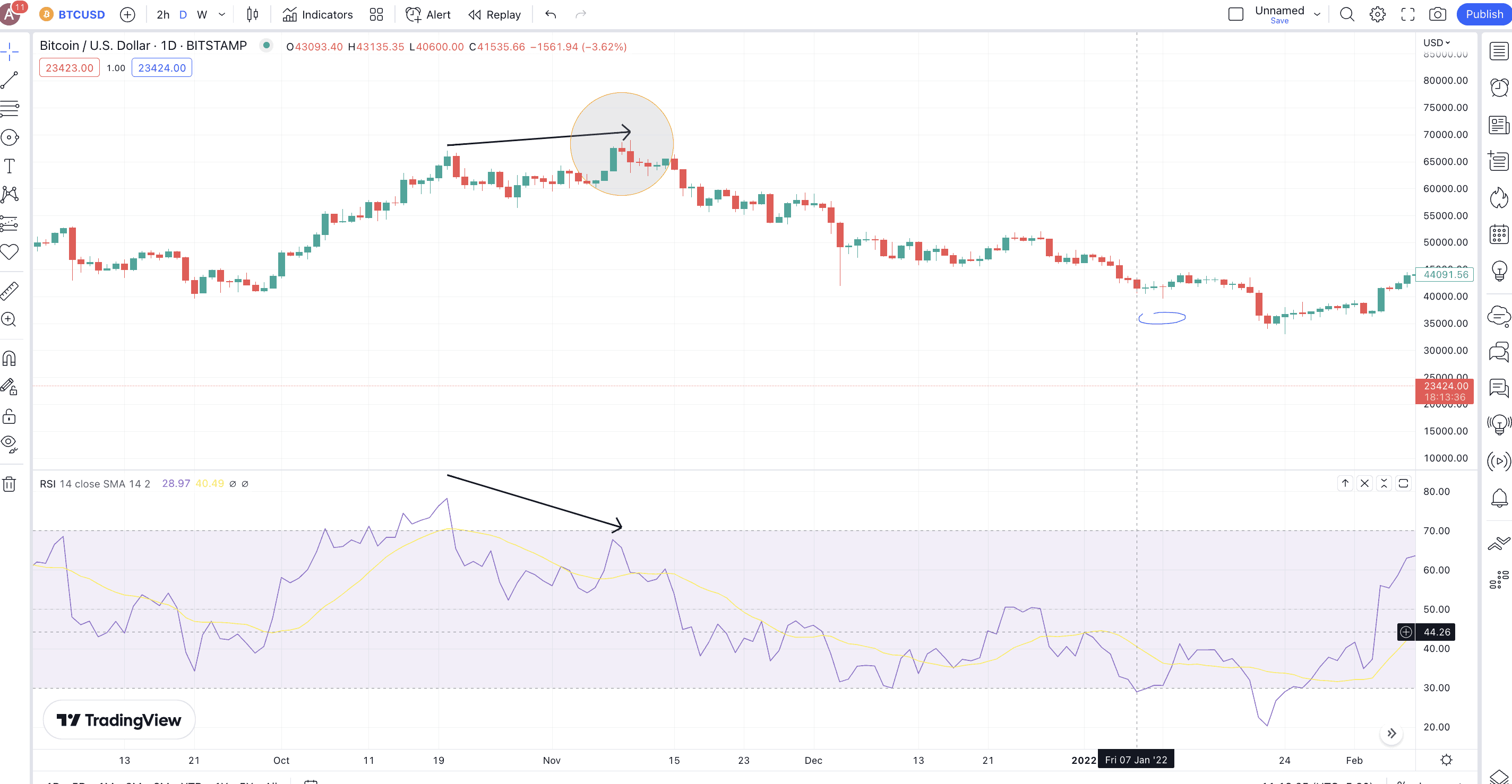
Here is a BTC chart segment from November 2021’s peak. Notice that the bearish RSI divergence did hint at a price drop. Right when the RSI confirmed a weak trend, an Evening Starts candlestick pattern (encircled zone) showed up. And we all know how the prices moved afterward (down, signifying the beginning of the crypto crash!)
Use formations to confirm
Even if you have identified a candlestick pattern, you might need to use the sloping trendline breaches and pattern breakouts to confirm the same.
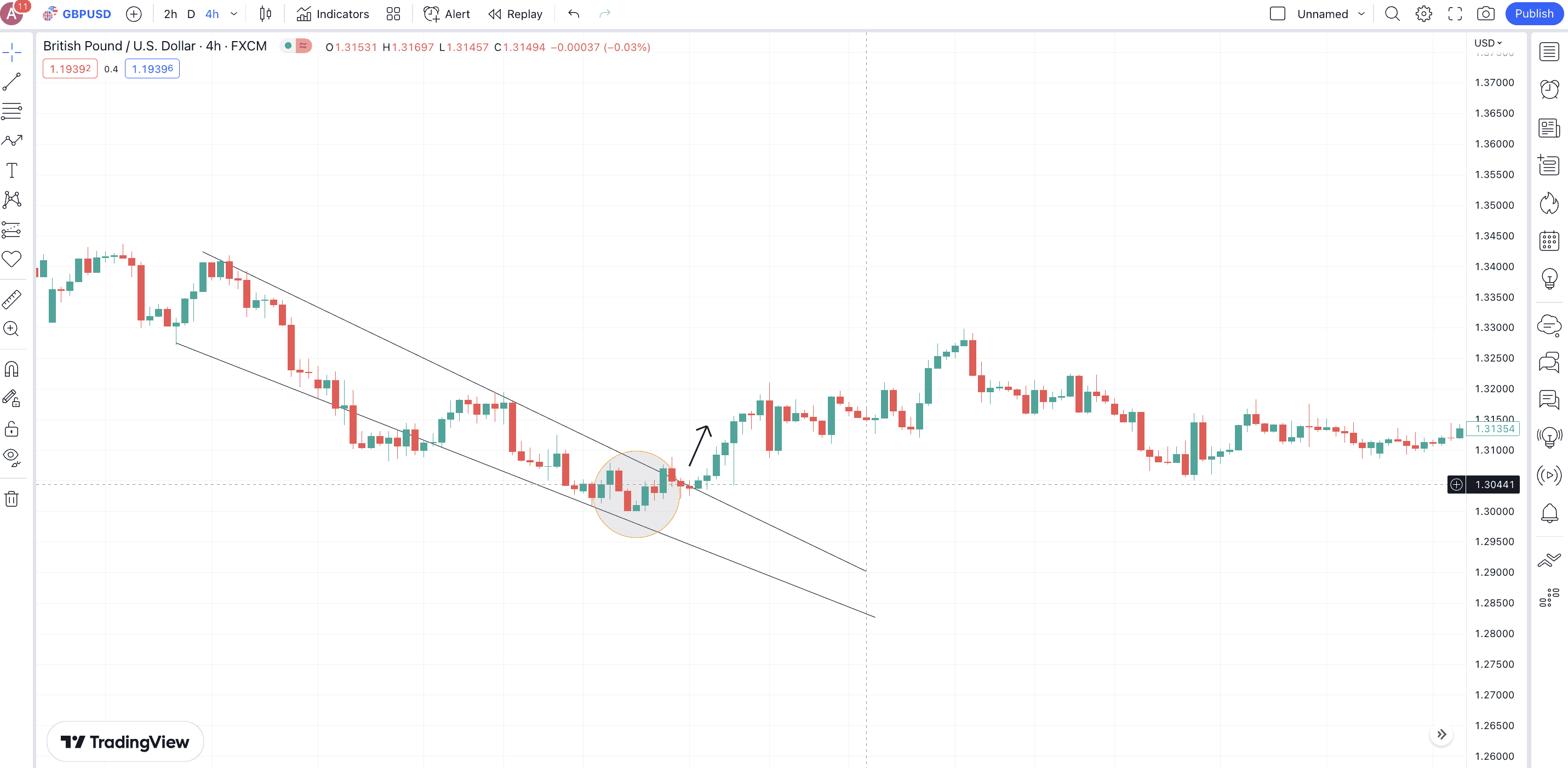
Here is a GBP/USD chart where the encircled zone has a bullish (three inside up) candlestick formation in place. However, a good confirmation would be the price of GBP breaking out of the falling wedge pattern, which confirms the strength of the bullish reversal candlestick pattern.
And that sums up all the reversal candle identification strategies. Now let us move to the specifics.
Bullish reversal candlesticks: top ones explained
It’s time to take a closer look at the top bullish reversal candlestick patterns. Here are the ones we picked:
Three white (green) soldiers
Definition
This bullish reversal pattern usually shows up at the bottom of a downtrend. It is a “three candle” formation. The three white soldiers can also be considered three green soldiers, depending on which chart you use.
Formation
All the candles associated with three white soldiers or green soldiers should be of the same color. The first candle should be a long bullish one, with the second one being similar but opening at a price higher than the close of the previous candle. The third bullish candle should also be long, again opening higher than the previous candle’s close.
However, you get a more reliable signal if the third candle closes near or above the high of the second candle.
Example
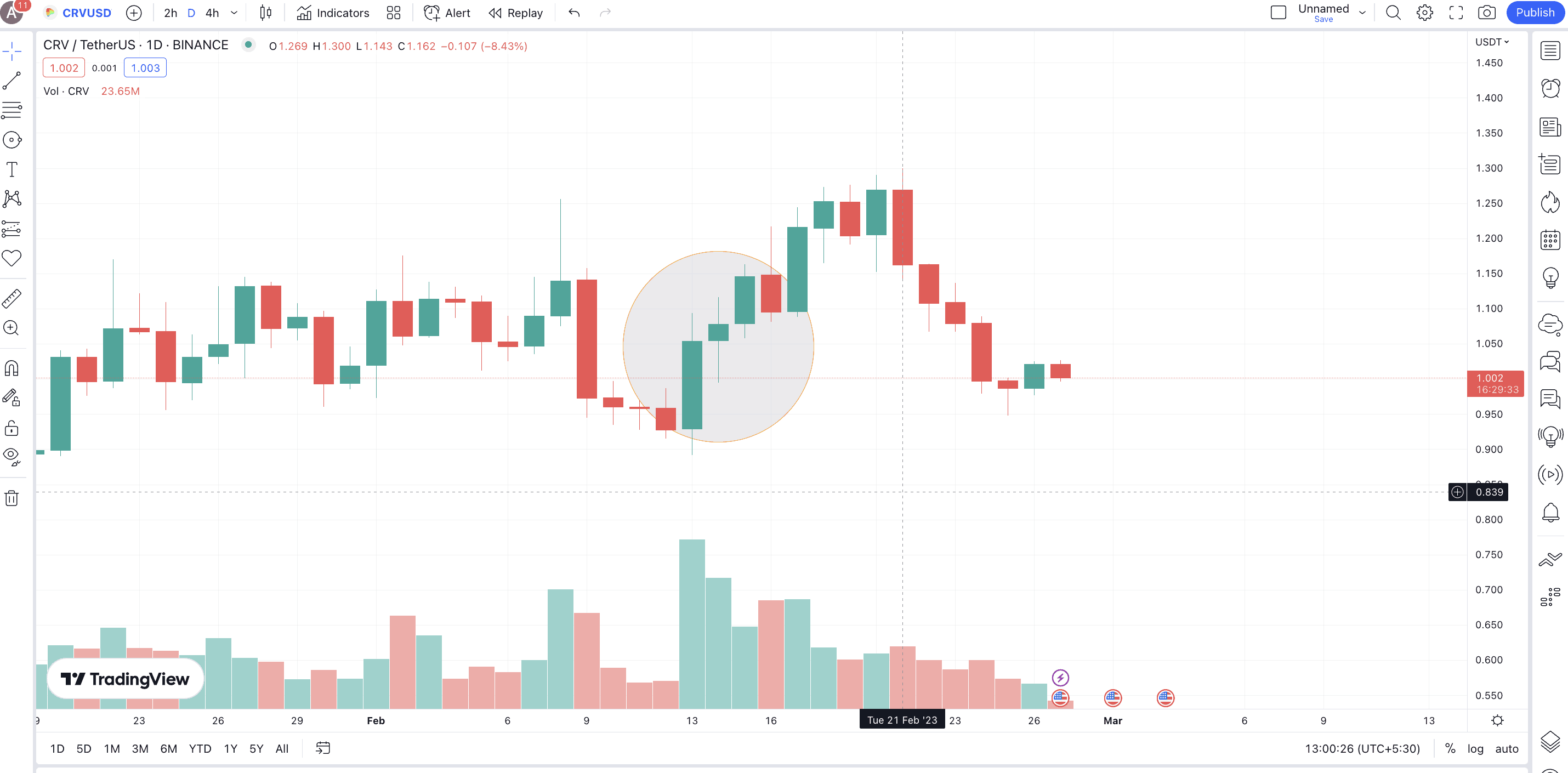
The CRV-USDT chart with the encircled zone shows the “three white soldiers” formation. Notice that the region has also attracted massive trading volumes, which might be able to push the prices of Curve Finance (CRV) higher.
Pattern quality
Three white soldiers is a strong and highly reliable bullish reversal candlestick pattern, provided you encounter it during a clear downtrend or a deep consolidation.
Preferred time frame
While the three white soldiers pattern can work in any timeframe, longer candlestick charts, weekly or even daily, offer a more realistic ground for traders to work with.
And finally, we would advise you to cross-check this bullish formation with RSI and OBV indicators, support and resistance levels, and pattern breakouts, if any.
Three-line strike
Definition
The three-line strike pattern is formed on the idea that one massive bullish candle can quickly erase the confidence of most sellers, leading to a price surge. It is a four-candle pattern with three bearish ones eventually getting bested by a bullish one. The idea here is a quick and dramatic shift in market sentiments.
Formation
The pattern starts with the asset forming three long bearish or red candles. You should see that each candle closes near or lower than the low exhibited by the last candle. Then there should be a long bullish candle that opens lower than the lows of all the previous three candles.
Even if the shadow or wick of the bullish candle reaches lower than the lows made by the bearish candles, we expect this pattern to hold. The close of the bullish candle should be higher or at least equal to the high of the first bearish candle. In the end, there seems to be a hint of bullish engulfing.
For a bearish three-line strike pattern, you should see three long green candles followed by a long bearish candle.
Note: Do not get confused as the opening and closing points are placed opposite for bullish and bearish candles.
Example:
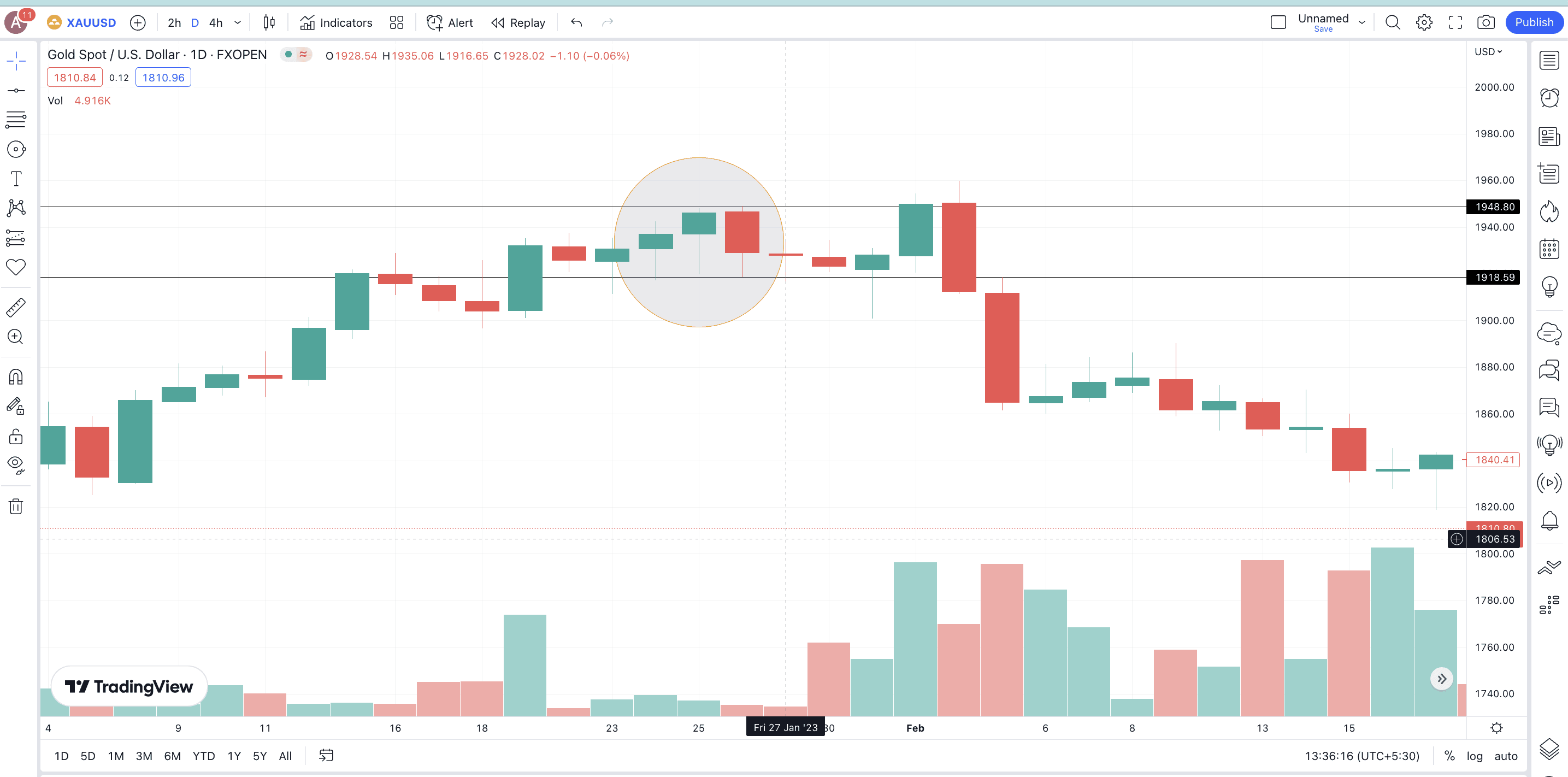
The GOLD-USD chart with the encircled zone shows a bearish three-line strike candlestick pattern, leading to a quick price drop. The closing price of the last (bearish) candle isn’t clearly lower than the opening price of the last candle, but still close. Hence, some amount of approximation is acceptable.
Pattern quality
Do note that the three-line strike can also be a bearish pattern if the first three candles are bullish and the last, longest candle is bearish. The ability to fit in regardless of the trend makes the three-line strike one of the more reliable candlestick patterns.
Preferred time frame
This pattern works best even for smaller timeframes — hourly or 4-hour candlestick charts. Yet, we would be more sure if we saw this on a daily or a weekly chart, as then we can get more confirmations for the same.
Morning star
Definition
The idea behind the morning star candlestick pattern is that a gap-down move, in a downtrend, can be dramatically optimistic for the prices. Do note that this is one of the many “three candles” candlestick patterns. Also, the overall idea of a morning star pattern is the decreasing selling or bearish pressure.
Formation
The first candle should be a standard, bearish one with longish shadows and a long body. However, the second candle should be placed in a gap-down zone from the last candle. Simply put, the second candle should surface even lower than the low of the first bearish candle.
The second candle can be either red or green (bearish or bullish). The color doesn’t matter here. Instead, the focus now shifts to the third candle, which should be bullish (green) and might open near the high of the second candle. The close of this third candle should be above 50% of the real body of the first long bearish candle. If it closes higher than the midpoint of the first candle, the pattern becomes stronger.
Example
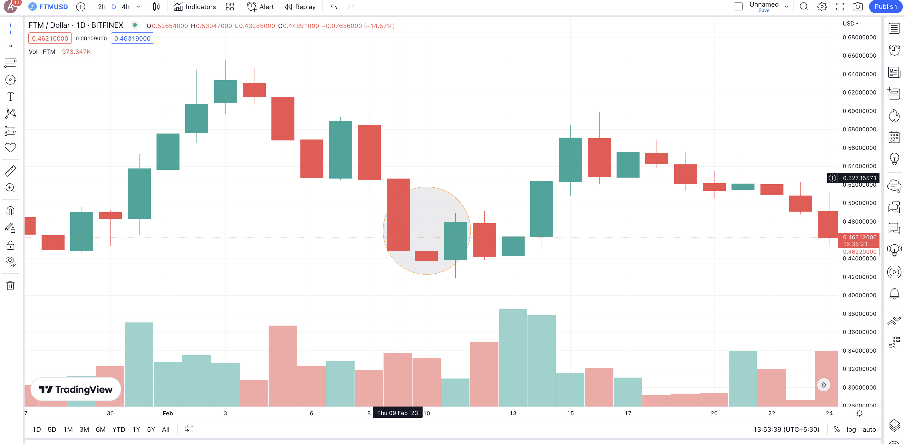
Here is an FTM-USD chart with the encircled zone showing something close to a morning star pattern, with a bearish, small-body candle as the second point. Notice how the price shot up after the pattern formation.
Pattern quality
The morning star pattern is reliable, and the real body length of the last bullish candle determines the extent of the same.
Preferred time frame
Most traders prefer using the morning star with RSI and volume-specific indicators on a daily chart.
Morning Doji Star
Definition
This pattern comprises three candles with a Doji candle in between. This means assets encountering the morning Doji star candlestick pattern might be preparing for an uptrend (a reversal from a downtrend) courtesy of market uncertainty. Also, if a long-legged Doji shows up instead of a standard Doji, the reliability of this pattern might reduce.
Formation
Coming to the formation, the first candle should be a long bearish (red) one. Then should come a gap down Doji. This is what signifies a reversal. The final confirming candle should be long and must close above the midpoint of the first red candle. And from the midpoint, we mean 50% of the real body, not the wicks.
Example
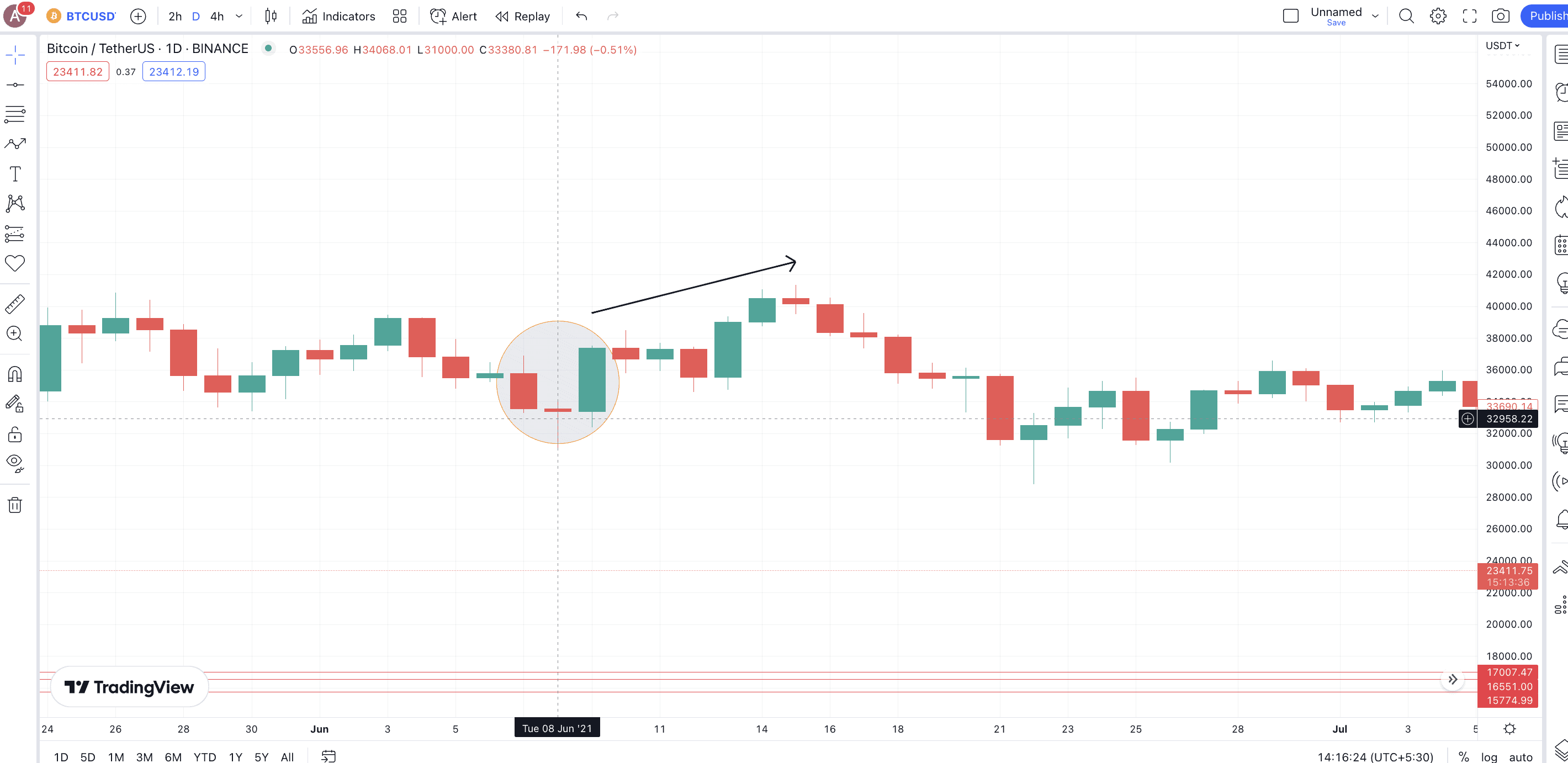
The BTC-USD chart in June 2021 shows a visible Morning Doji star. Notice how the Doji is formed at a gap down from the first red candle. The next green candle doesn’t just cross the mid-point but forms a bullish engulfing formation of shorts.
Notice that the pattern didn’t generate a massive surge due to the presence of the long-legged Doji.
Pattern quality
Even though this isn’t the strongest candlestick pattern, it is quite reliable. The size of the green panel and the type of Doji are factors that add to the pattern’s reliability.
Preferred time frame
It is advisable to use this pattern for preparing price predictions only in a daily or weekly timeframe. That way, you will have several data points to work with.
Engulfing pattern
Definition
As the name suggests, a bullish engulfing pattern comes to light when a green and bullish candle completely engulfs the previous (bearish one). A clear engulfing often results in massive trend reversals. Interestingly, engulfing patterns can appear even during whipsaws (rangebound movements). And these “two-candle” candlestick patterns are quite common.
Formation
For an engulfing pattern, there should be a long bearish candle followed by a long bullish candle. The opening and closing prices of the second candle should be lower (equal) and higher than the closing and opening prices of the previous candle.
Example
Here is the BTC-USD chart from July 2021, when a bullish engulfing pattern led to a relief rally.
Pattern quality
If all the mentioned guidelines are followed, bullish engulfing is easily the most reliable candlestick reversal to consider.
Preferred time frame
You are better off using this technical analysis pattern on a daily candlestick chart. Also, to check the strength of the reversal, you might want to pair it with the RSI and volume indicators.
Three Outside Up pattern
Definition
If you look closely, you will notice that the “Three Outside Up” is more like an extension of the bullish engulfing pattern. There are three candlesticks present, and the reversal prediction is way more accurate. Plus, this pattern shows up more prominently during a prolonged downtrend.
Formation
The first candle should be a long bearish one. Following this should be a bullish candle that completely engulfs the first candle. The third candle should also be bullish and close above the previous candle’s high.
Example
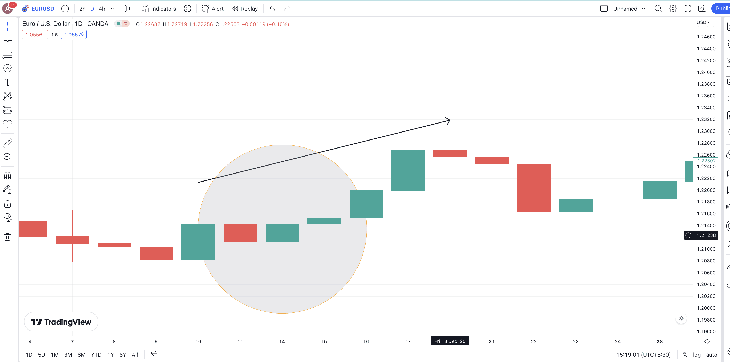
Even though the example isn’t absolutely accurate, the EUR-USD chart shows a Three Outside Up pattern as of Dec. 14, 2022. Check how the next green candle completely engulfs the red candle. And the third candle also ends up closing above the close of the first candle. A price surge followed.
Pattern quality
The Three Outside Up is one of the strongest patterns that can predict candlestick reversals. Adding another candle to validate the market bullishness adds to the reliability of a bullish engulfing.
Preferred time frame
As it’s more accurate, you can even use the Three Outside Up pattern on a daily or a four-hour chart. However, looking for pattern breakouts to confirm the trend further might be a better approach to using it.
Abandoned Baby (rare pattern)
Definition
This pattern is similar to the morning Doji star but with a twist. The real body of the candles involved should be separate; even the shadows or wicks shouldn’t overlap. This is what makes the abandoned baby pattern more accurate.
Formation
The Abandoned Baby pattern is made of three candles. The first candle should be a long bearish candle. The second one should be a long gap down Doji with zero overlaps with the first. And the third candle should be a gap-up green candle with zero overlaps with the Doji. The high speed of pattern realization makes the Abandoned Baby pattern a trigger for short squeezes.
Some variations can show up. These might be the Doji not exactly forming a gap down or some shadow/wick-specific overlap with the third bullish candle.
Example
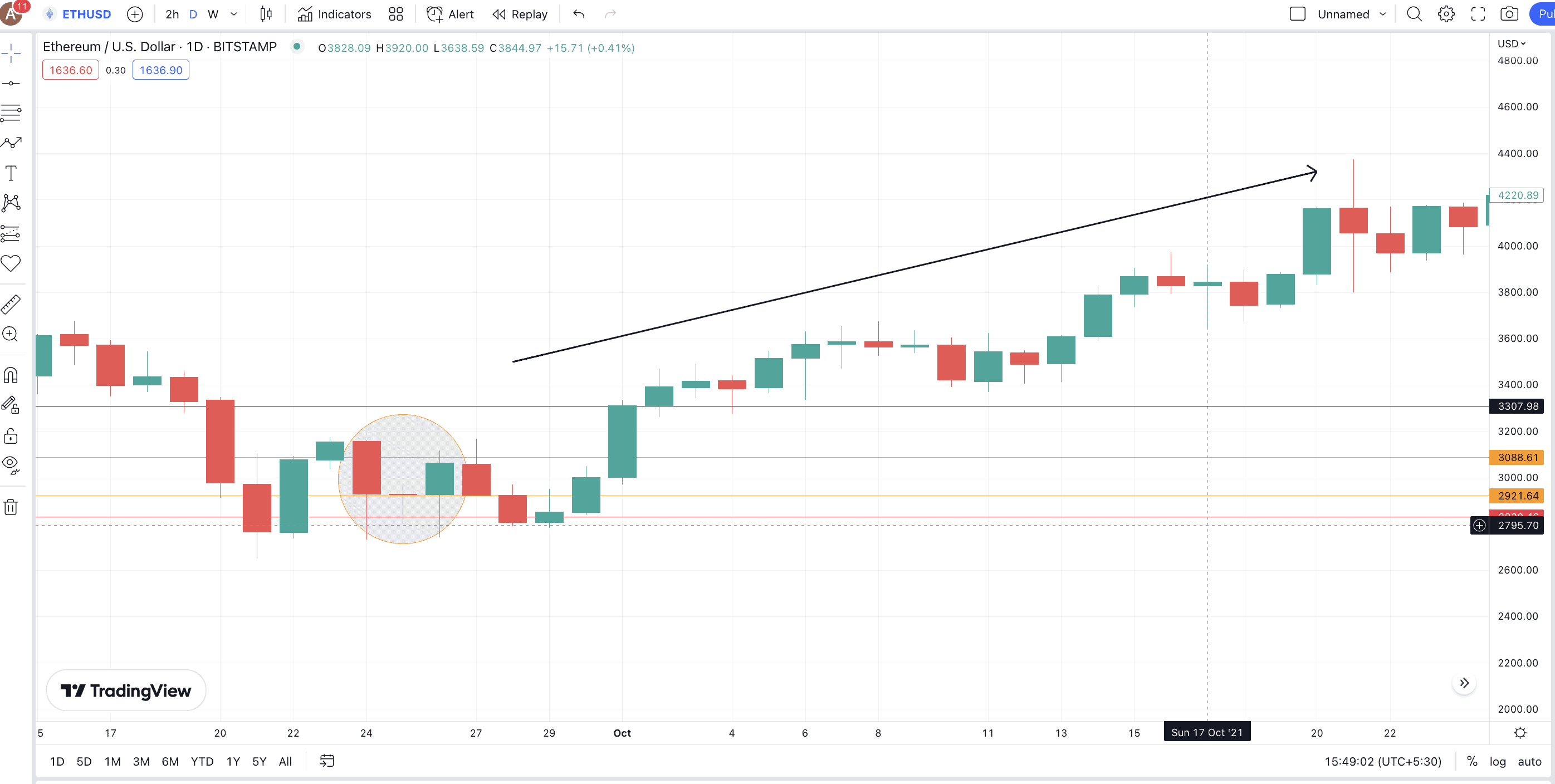
Here is an ETH-USD price chart with a partial Abandoned Baby candlestick pattern surfacing towards the end of September 2021. Notice the long red candle, a follow-up Doji (not gapped down), and a long bullish candle (still overlapping with the Doji). As it wasn’t a clear abandoned baby, the surge took some time to arrive.
Pattern quality
The bullish abandoned baby is very strong and reliable as a reversal pattern. The reason, as mentioned, is the clarity of pattern formation, with a focus on zero overlaps.
Preferred time frame
This candlestick pattern works best in any given timeframe owing to its strength and reliability. Regardless of the timeframe, you are better off using it with a pattern breakout indication and even the RSI momentum indicator.
Hammer
Definition
Unlike some of the other multi-candle patterns we mentioned, the bullish hammer is a single-candlestick pattern. Also, as it relies on one candlestick, the reliability quotient takes a beating.
Formation
This candlestick surfaces at the bottom of a downtrend or consolidation phase. A green hammer-like candle takes shape, with a small body (open and closed prices included) and a long tail (or a deep low zone from which the sellers were ousted to close higher). There shouldn’t be any top shadow, meaning the close price should be the candle’s high.
And while the hammer can show up at any point during a downtrend or consolidation, it is commonly observed after a Doji.
Example
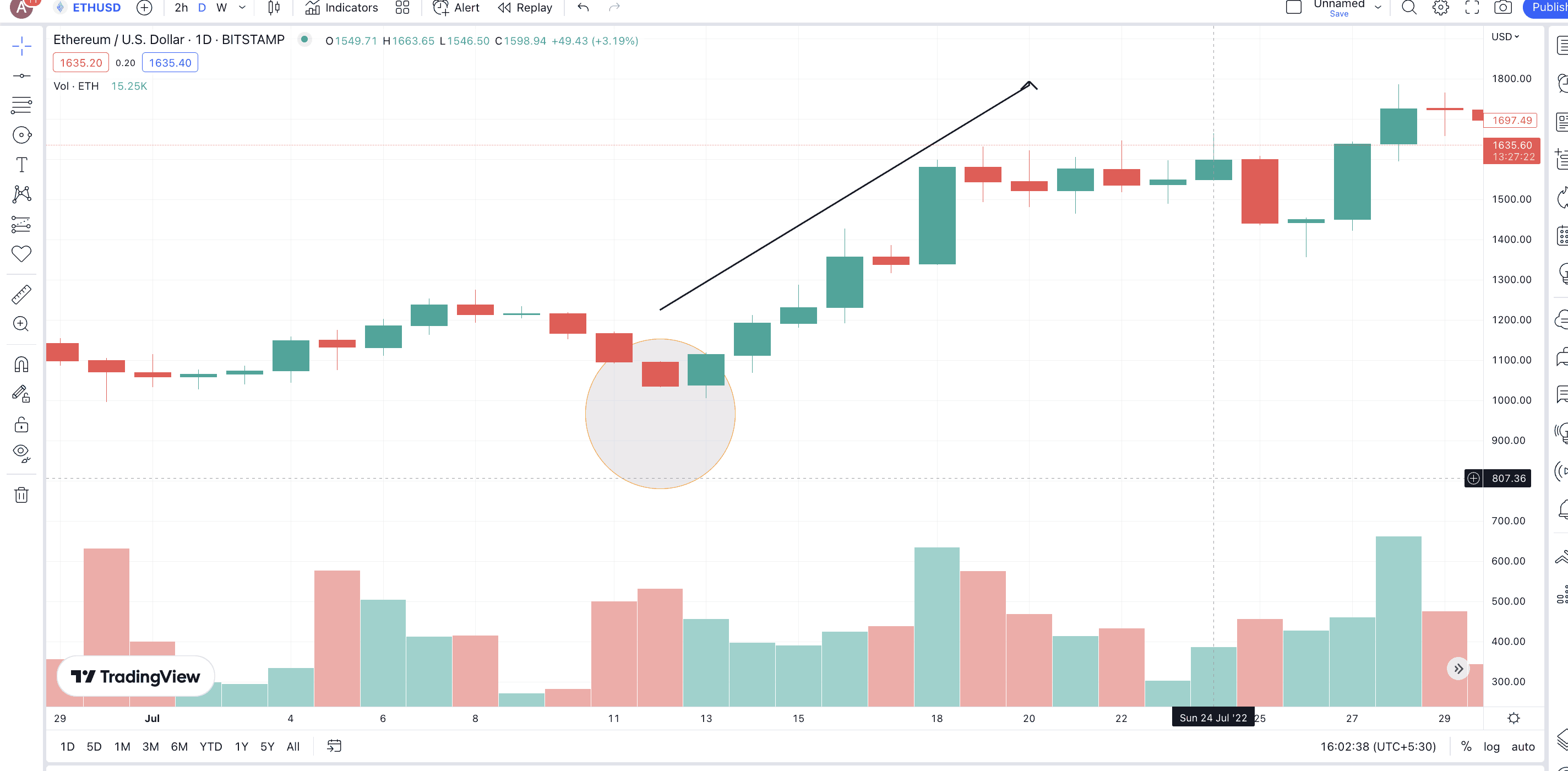
Here is the ETH-USD chart with a hammer pattern showing up close to July 13, 2022. Notice the price surge after the reversal pattern. Also, the volume was on the higher side post-pattern-realization. This shows that validating single candlestick patterns with other indicators is advisable.
Pattern quality
A bullish hammer is moderately reliable. However, it has the tendency to misfire and, therefore, should be taken with a pinch of salt.
Preferred time frame
While we do not mind using a bullish hammer in any timeframe, it can offer the best results when used with a weekly chart.
Bullish Harami
Definition
This is a two-candlestick pattern with a slow reversal psychology. Also, you can find a bullish harami pattern near the downtrend and not during consolidation.
Formation
The first candle should be a long bearish candle. The next one should be a green (bullish candle). However, the first candle’s real body should engulf that of the second candle. This shows that the despite the downtrend, buyers are slowly coming to the fold and trying to push the prices higher.
Example
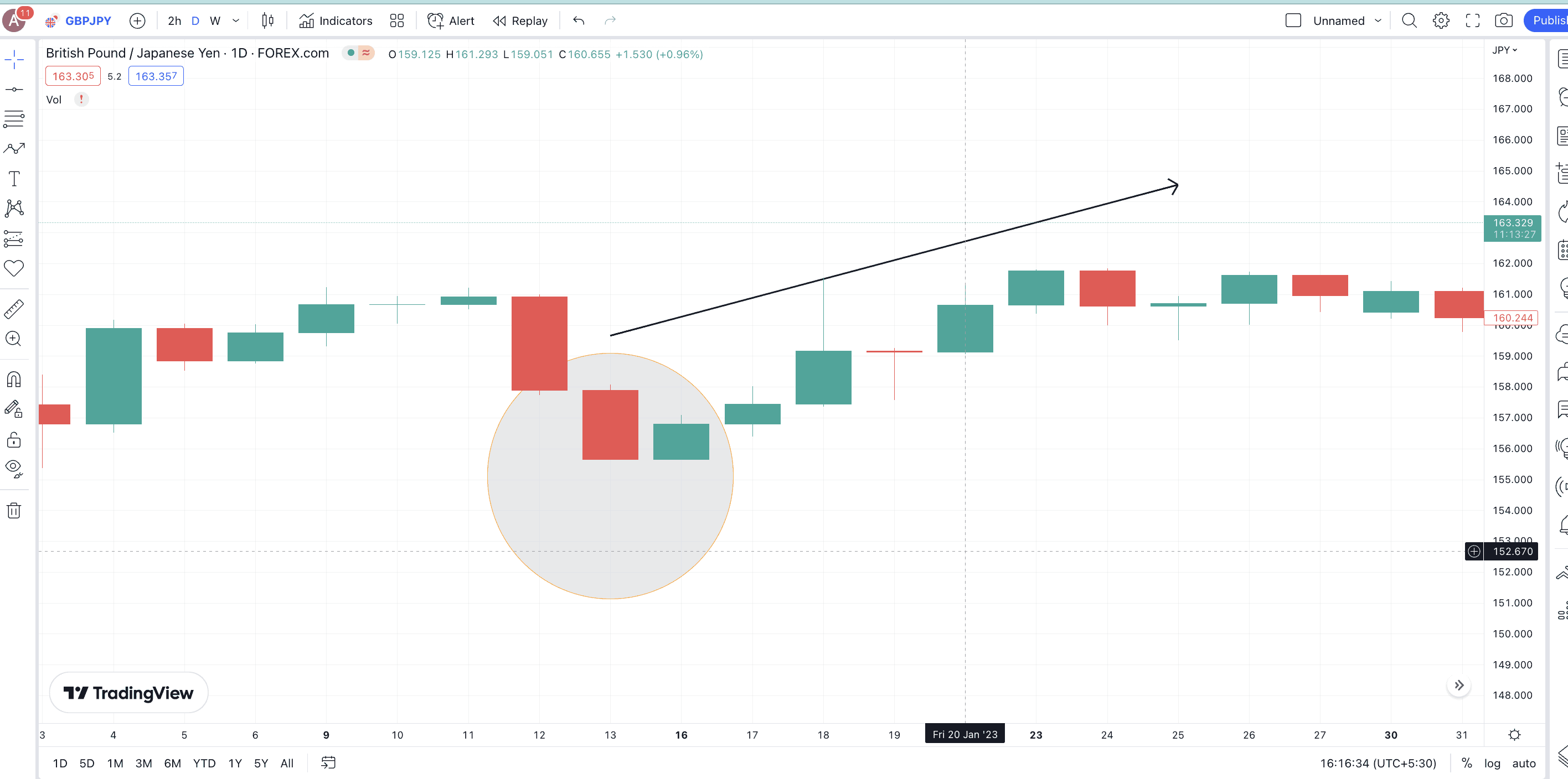
The recent GBP-JPY price chart shows that a bullish harami pattern was formed on Jan. 13, 2023. A price surge followed, albeit a short-lived one.
Pattern quality
A bullish harami is moderately strong. As the bearish candle is expected to be the bigger one in the pattern, some false indications might emerge in more regulated markets like equities. The bullish harami pattern might fall prey to manipulations in the equity space.
Preferred time frame
The best results from using this pattern come when you rely on daily and weekly charts. Plus, it is important to consider trading volume while analyzing the same.
Piercing Line
Definition
A piercing line pattern is more like halfway to bullish engulfing. And it works best when it appears at the lowest point of a downtrend.
Formation
It is a two-candle pattern. The first candle is a long bearish (red) one, and the second is a smaller bullish candle that opens below the first candle’s low. It then moves higher to finish above the red candle’s midpoint. Some more bullish power could bring about a bullish engulfing candlestick pattern.
Example
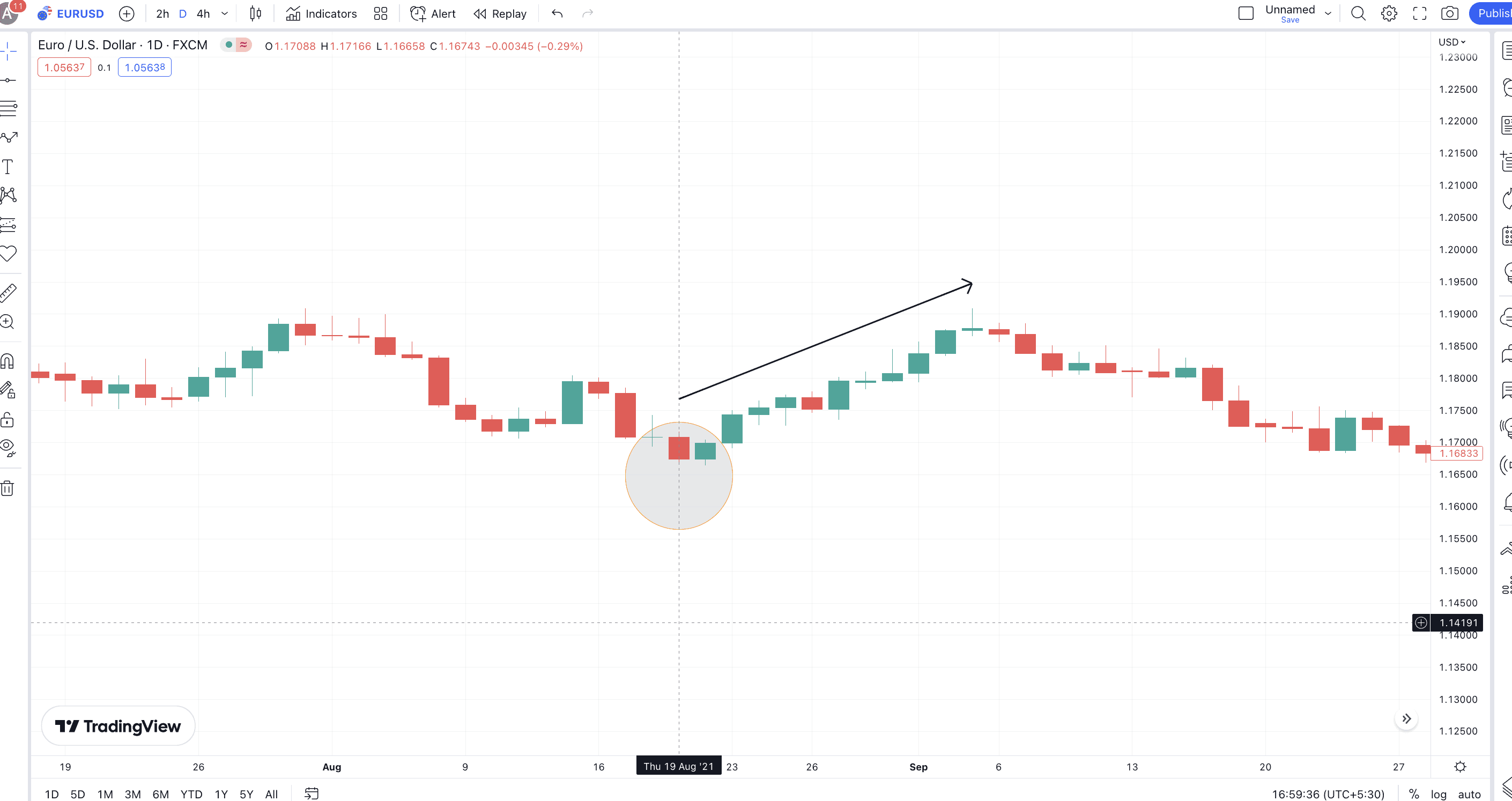
Here is the EUR-USD chart with the green candle opening below the red candle. It eventually moves up to cover more than 50% of the former. The price surge which followed was significant.
Pattern quality
Traders consider it a strong reversal pattern. However, for the expected price surge to the surface, the piercing line or any other bullish reversal pattern requires additional trend-agnostic confirmation candlesticks.
Preferred time frame
This pattern works best when you have a daily chart pattern or a four-hour pattern at your disposal. Also, consider pairing it with chart patterns and moving average crossovers to predict the entry and exit points.
Bearish reversal candlesticks: top ones explained
Here are the most reliable and easily identifiable bearish reversal candlestick patterns to work with:
Three black crows
Definition
Three Black Crows is one of the more reliable bearish reversal candlestick patterns. It can surface at the peak of an uptrend or even show the transition from a relief rally to a continuing downtrend. Also, it is a three-candle pattern, per the name.
Formation
This pattern surfaces when you see three consecutive red (Black) or bearish candles. Each candle till the last closes below the previous candle’s close. Also, the opening price of each candle should fall anywhere between the real body of the previous candles, barring the first one.
Example
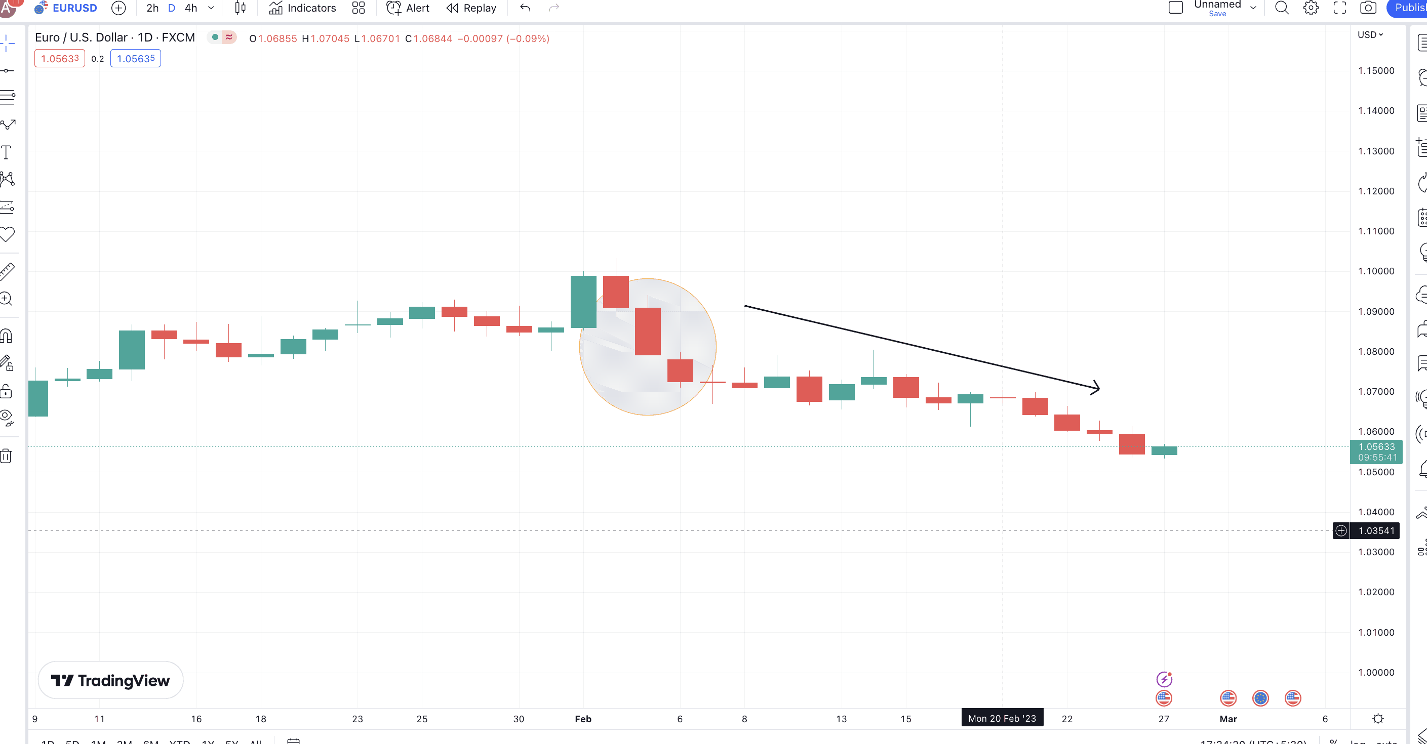
The current EUR-USD chart shows the formation of the Three Black Crows candlestick pattern around Feb. 2, 2023. This gives the future EUR-USD price outlook a more jaded appearance.
Pattern quality
As mentioned, this is one of the strongest and most reliable reversal candlestick patterns. It benefits from the emerging concrete psychology of seller domination. While the pattern is strong enough, a follow-up bearish candle might offer some added confirmation.
Preferred time frame
You are better off using this reversal pattern with daily and weekly charts for the additional reference points that they offer. Plus, they work wonders when paired with signs like death crossovers and bearish RSI divergences.
Identical Three Crows
Definition
The overall interpretation of this pattern is nearly the same as Three Black Crows. Plus, it is also a three-candle pattern, primarily visible at the peak of an uptrend.
Formation
The formation comprises three red candles, each opening within the body of the previous. The close, however, doesn’t always need to be lower than the previous day’s low but can be equal to or even a bit higher than the same.
Pro-tip: You can still distinguish a Three Black Crows pattern from an Identical Three Crows pattern. The latter is more accurate and doesn’t always have wicks or shadows.
Example
Tesla’s (TSLA’s) chart from 2020 shows an Identical Three Crows pattern. Notice that the prices were corrected briefly. Also, this pattern arose during a relief rally and not an uptrend.
Pattern quality
This pattern predicts a trend reversal more accurately than the Three Black Crows. However, pairing it with volume and RSI-like indicators gives more accurate results.
Preferred time frame
This pattern works best when used with daily candlestick charts.
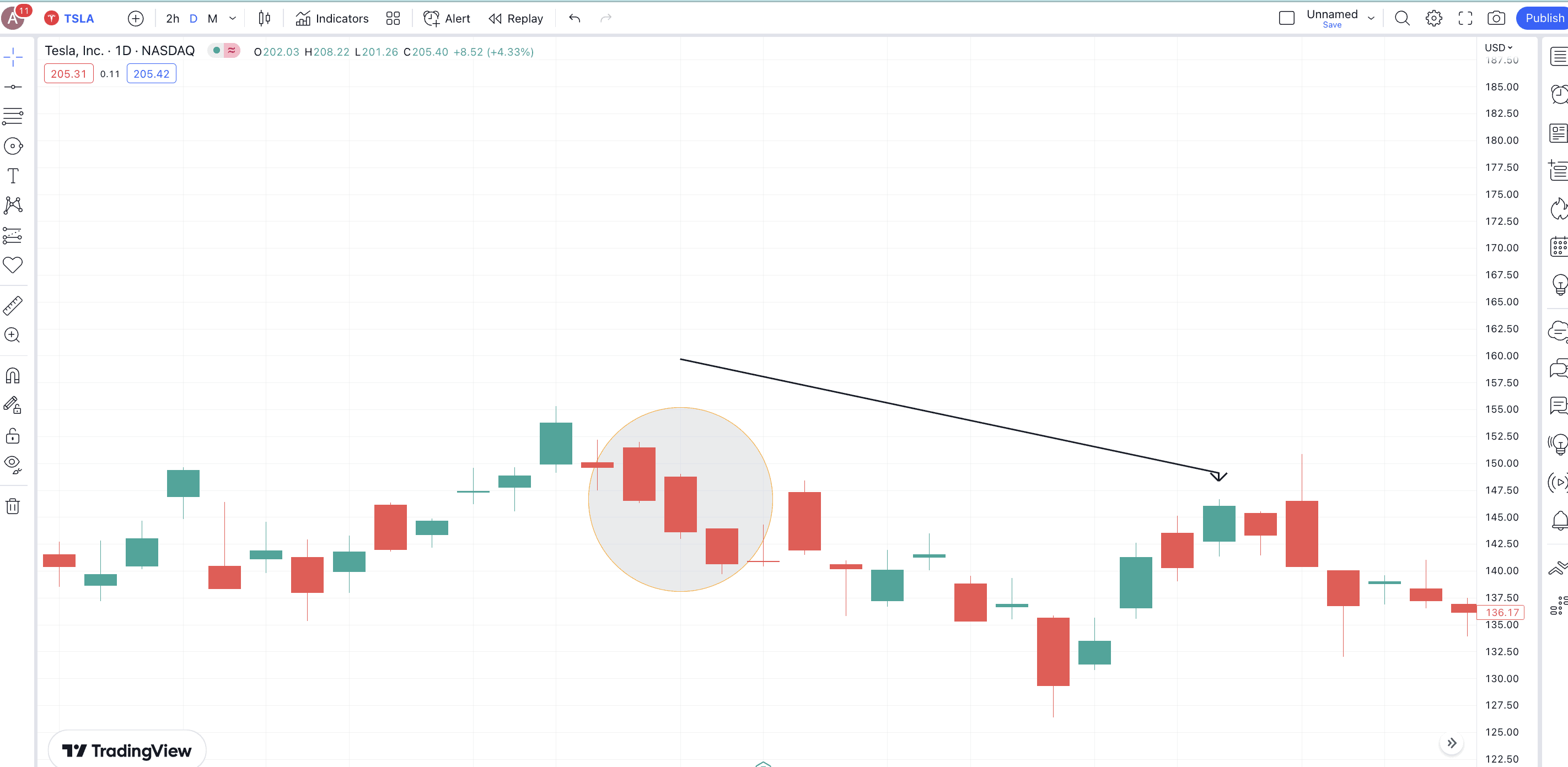
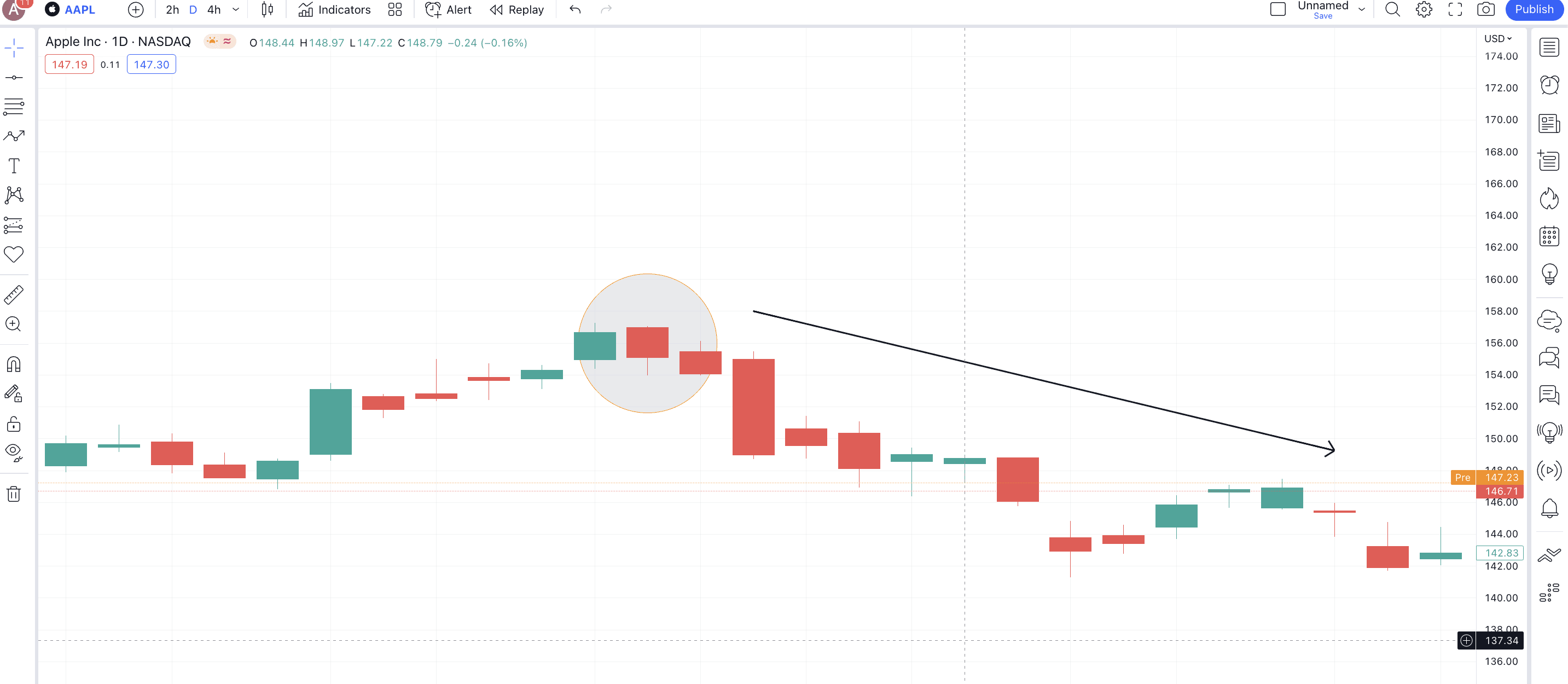
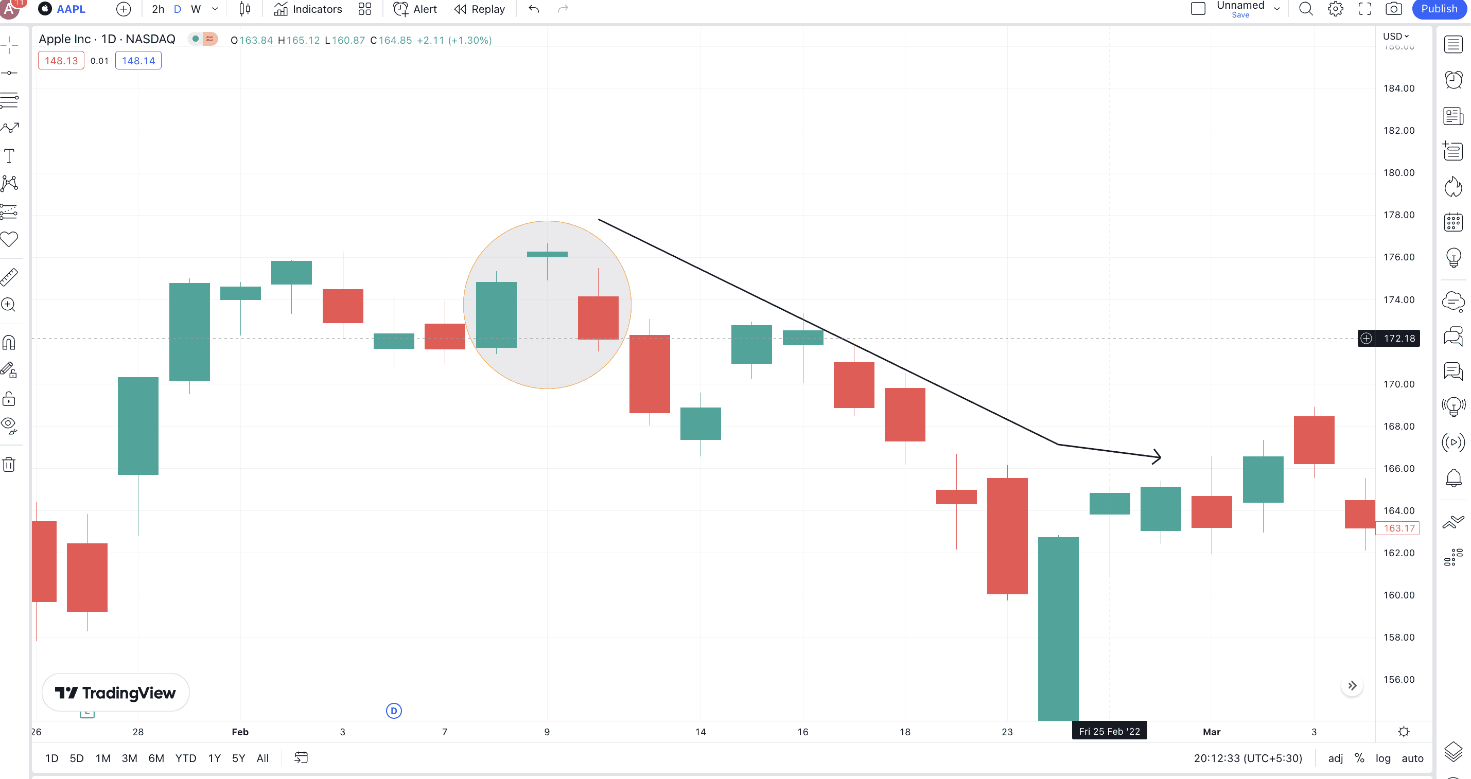
Evening Star
Definition
The Evening Star pattern is simply the bearish counterpart of the morning star pattern. It showcases a potential reversal from the peak. Also, it is a three-candle pattern.
Formation
The first candle should be a long green or bullish candle. The next candle is a small gap-up formation, with a small body (green or red) and an open price higher than the previous pattern’s close. Finally, the last red (bearish) candle covers a lot of the first candle’s real body, showing significant selling pressure.
Example
Here is the AAPL chart where we have picked an evening start pattern for you. Notice how the red or the bearish candle breaks lower to validate a bearish pattern further.
Pattern quality
The evening star is extremely reliable, but it is always better to have a few confirmations (bearish) candles for added validation.
Preferred time frame
Longer timeframes work better with the evening star formations. Also, they pair really well with momentum indicators and pattern breakouts.
Evening Doji Star
Definition
This pattern is similar to an Evening Star, but as there is a Doji in play, the accuracy is on the higher side.
Formation
The first candle remains a green, long one. The second one should now be a gapped-up Doji. Finally, the third candle that shows up should be red and go deep towards the real body of the green candle. It is fine even if the red candle closes below the opening price of the green candle.
Example
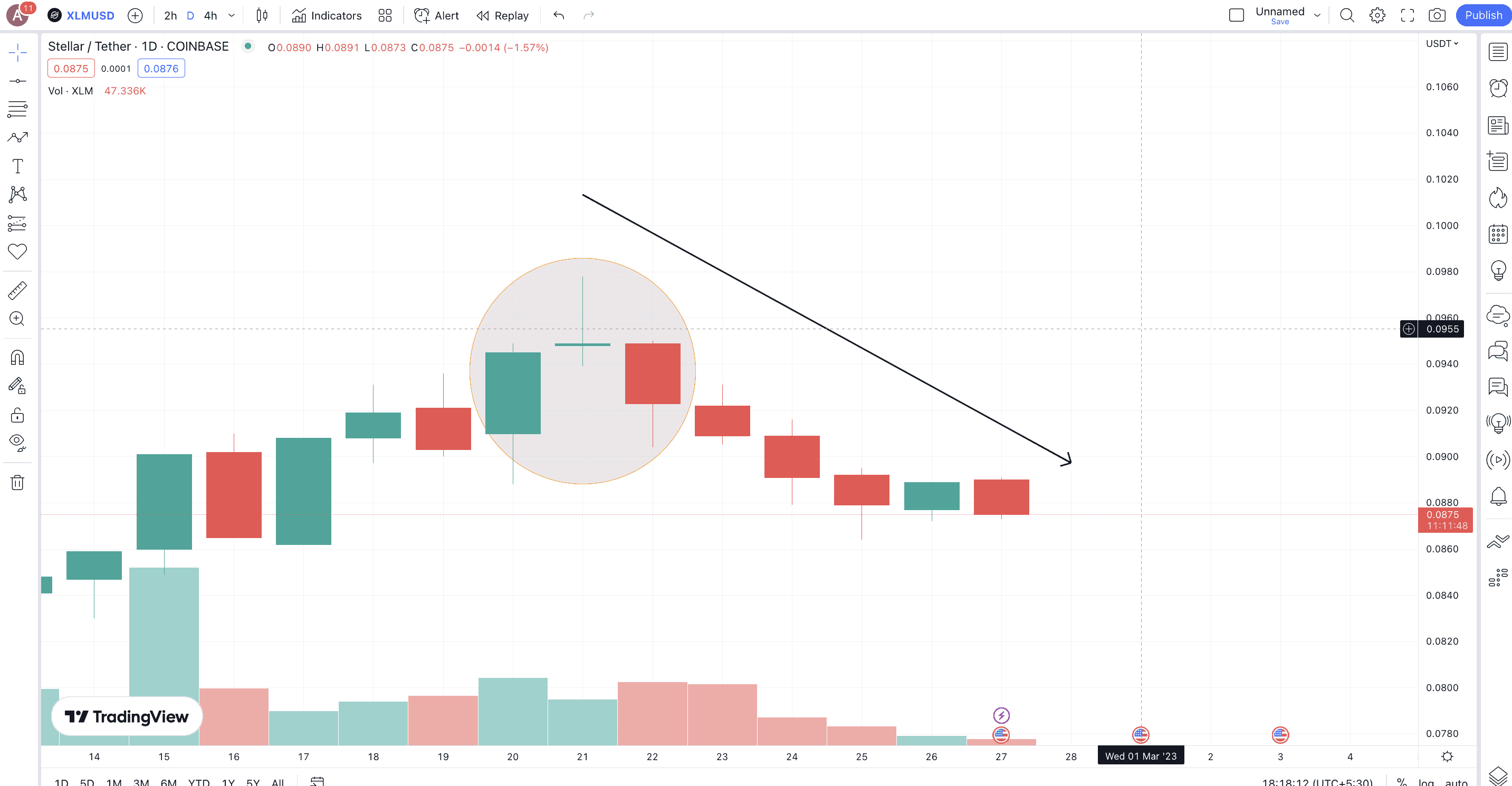
We now have the XLM-USD chart as an example. Stellar (XLM) has started correcting post the recent rally with the encircled zone showing a clear evening Doji star.
Pattern quality
This is one of the more reliable reversal candlestick patterns to date. However, it becomes even more effective when it shows up at the peak of a bullish uptrend, helping short-sellers enter positions.
Preferred time frame
This pattern is the best for weekly charts or daily timeframes.
Shooting Star
Definition
This pattern is commonly seen across asset classes, including forex, stocks, commodities, and crypto. Also, this is a single candlestick pattern, like the bullish hammer, but only in reverse.
Formation
A green or red body might form with a long upper shadow or wick. The meaning here is that the buyers did try to push the prices higher, helping the asset reach a new high. However, sellers prevailed, pushing the prices to opening levels. The ideal situation is no lower wick, but a smaller one can be ignored.
Pro tip: Some traders believe that for a shooting star to succeed, the upper wick should be twice that of the body (at least).
Example
Here is a BTC-USD chart with a bearish reversal or shooting star candlestick pattern in play. Notice that the chart also shows a few confirmation candlesticks with multiple red candles forming below the low of this shooting star candlestick.
Pattern quality
The shooting star is a moderately reliable pattern. However, most experienced traders use it for early detection or warning signs for future price dips.
Preferred time frame
You can use this chart across any timeframe. But you get the most out of it on a weekly chart, courtesy of those multiple touchpoints.
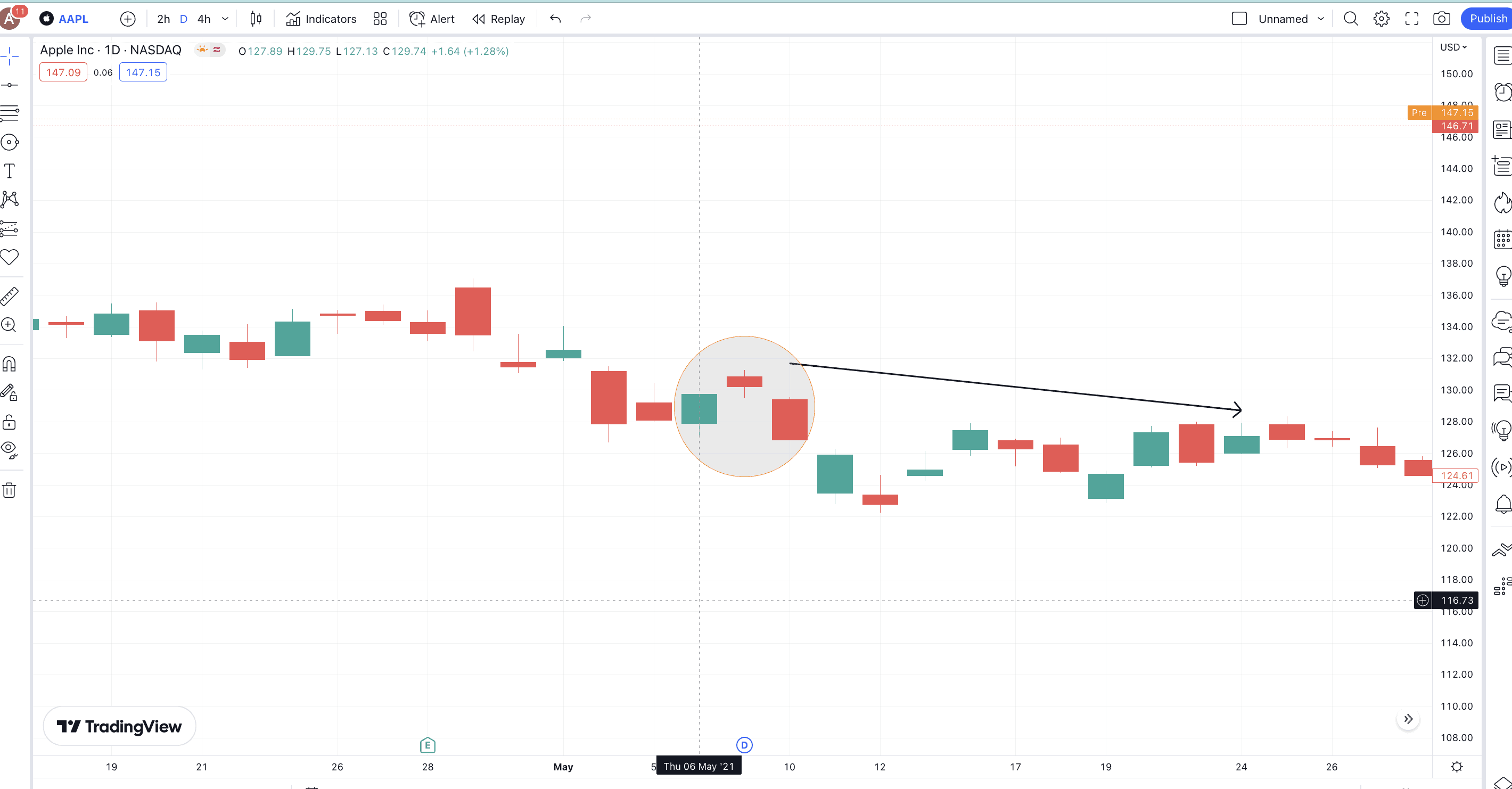
Dark Cloud Cover
Definition
The dark cloud cover is a powerful trend reversal pattern that is very much like a bearish engulfing. To work with this model, you need to locate a few more bearish candles as confirmation signals. Also, you can use this pattern with crypto, stocks, and commodities alike.
Formation
The pattern formation is pretty straightforward. There should first be a long bullish candle, following which there should be a smaller bearish candle. This should open higher than the previous candle’s high and close anywhere further than the previous midpoint.
Note: While the red candle is preferred to open above the high of the previous green candle, opening above the previous candle’s close is also fine.
Example
Take a look at AAPL’s chart, where you can see a dark cloud cover forming on Sep. 7, 2021, and Sep. 8, 2021. Notice that a red confirmation candle also follows the formation, followed by a massive price dip.
Pattern quality
The sell signal on display by the dark cloud cover is moderately strong. If you are looking to use it for specific crypto, you might want to look at the broader market conditions to gauge the extent of the trend reversal.
Preferred time frame
The dark cloud cover is one of the better reversal candlestick patterns to be used on a daily chart. However, weekly indications using this pattern can also make sense.
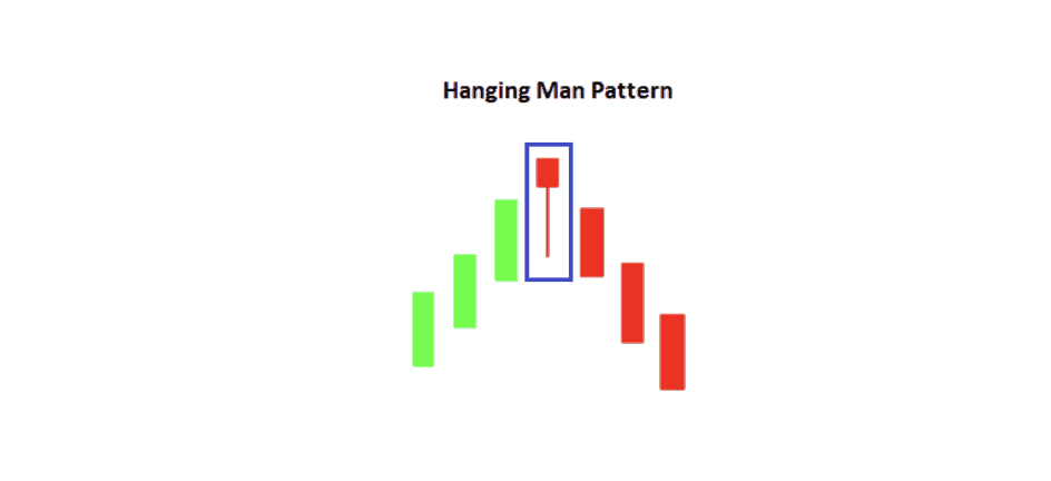
Hanging Man Candlestick
Definition
Check out the Hanging Man if you are still looking for a one-candlestick pattern to understand the market better. Also, the color of the candle can be either red or green, but the red feels more apt and bearish as we are now discussing bearish reversal candlestick patterns.
Formation
A Hanging Man is like a hammer inverted. The body is small, and there is a long lower wick and a short or negligible upper wick.
Example
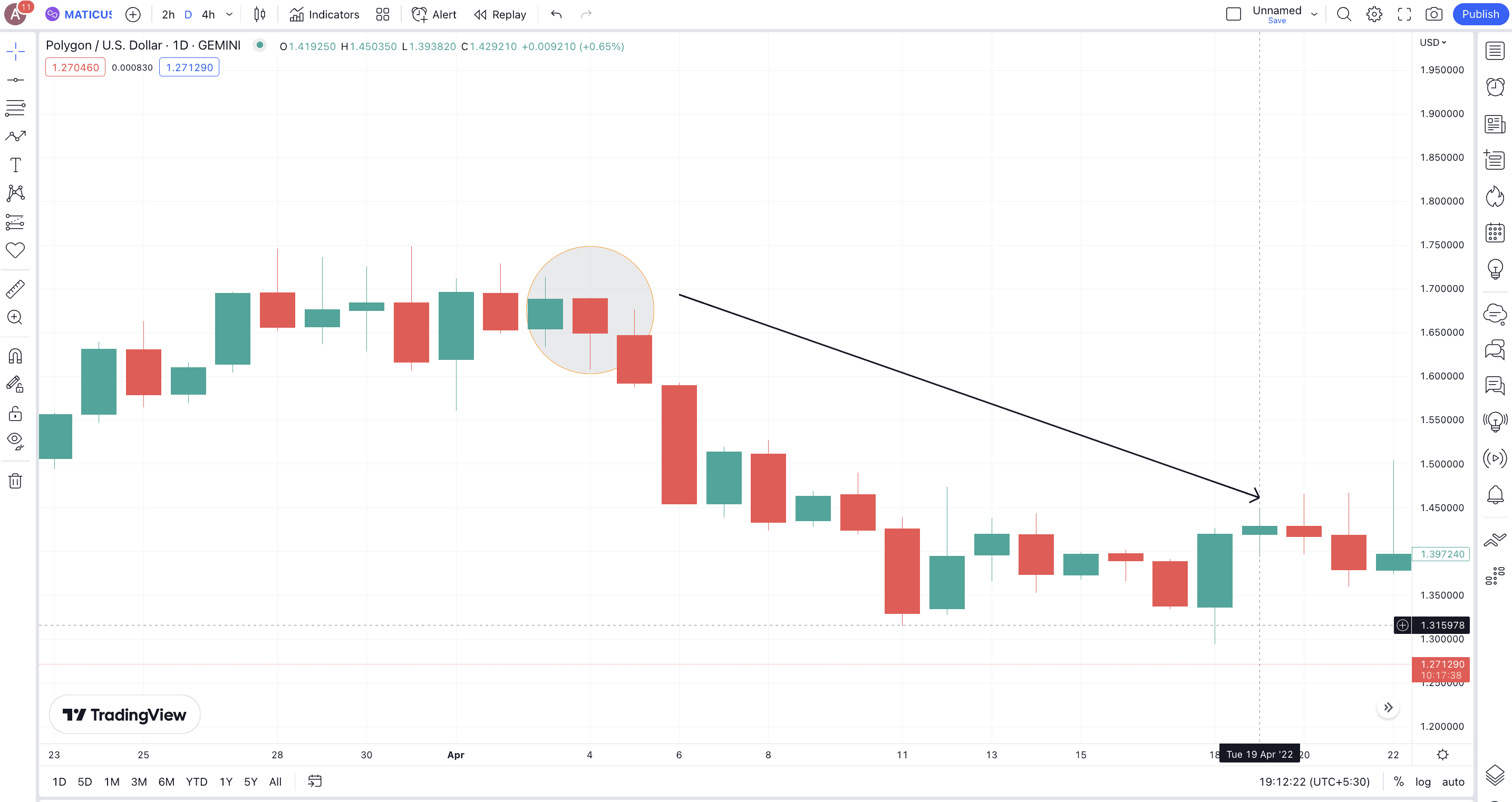
Here is a quick daily price chart of MATIC against USD. Notice how the clear hanging man pattern surfaced on April 4, 2022. There is a confirmation candle to follow, which aptly closes lower than the low of the previous candle (hanging man itself).
Pattern quality
The hanging man is a relatively reliable pattern, provided it is located right at the peak of an uptrend. During a relief rally, it must be checked against multiple candles, indicators, and patterns.
Preferred time frame
We like using the hanging man candlestick on daily and even weekly charts. That helps us get more confirmations, thanks to multiple data points.
Upside Gap Three Methods
Definition
If you are interested in credible continuation patterns that can also work as reversal candlestick patterns, the “Upside Gap Three Methods” is the one to consider. However, more than a trend reversal, the appearance of this pattern hints at a small-term consolidation.
Formation
This three-candlestick pattern starts with a long green candle, is followed by another gap-up green candle, and eventually a bearish candle that drops more than 50% compared to the first candle’s real body.
Example
Here is the AAPL chart from between May 3, 2022, and May 5, 2022. Notice that two green candles were formed, with the second candle remaining gaping from the first. The red or the bearish candle opens inside the real body of the second candle and closes lower than the opening price of the first candle, marking a clear downtrend and seller domination.
Pattern quality
The Upside Gap Three Methods pattern is relatively strong. Plus, the intensity of the drop or reversal depends on how deep the third candle goes inside the body of the first candle.
Preferred time frame
This is one of the few candlestick patterns to work best with daily and weekly timeframes. However, if you want to go shorter and opt for a 4-hour timeframe, this relatively accurate pattern might still make sense.
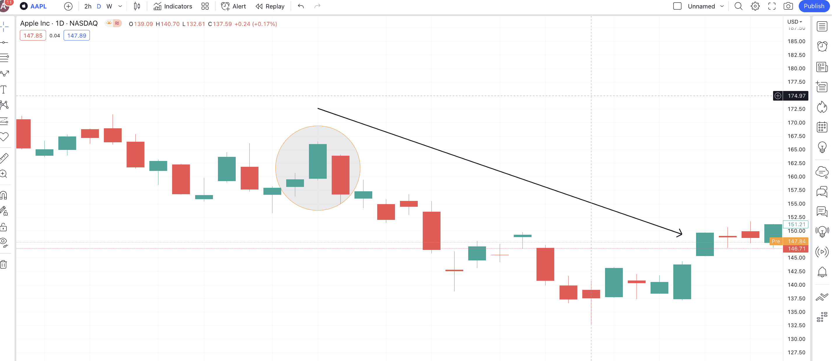
Abandoned Baby (rare)
Definition
Remember the bullish Abandoned Baby candlestick pattern? This is also a standard three-candle reversal pattern, seen primarily near the peak of an uptrend.
Formation
The first candle is a standard and green one (preferably long). The second candle should be a Doji, gapped up above the closing price of the first candle. The third candle should be a long, red one, opening preferably gap-down from the Doji.
Example
The encircled zone, corresponding to Apple’s daily chart, shows a rare abandoned baby pattern. Notice how the Doji is formed above the close of the first green candle. Also, the third red candle opens the gap down from the Doji. The price dip, post pattern formation, was significant.
Pattern quality
As an abandoned baby is rare, it is considered very strong. However, you still need a few confirmation bearish candles and volume-specific validations to enter and exit positions.
Preferred time frame
You can best use this candlestick pattern on a daily and four-hour chart. Also, you are not likely to locate this pattern on a weekly chart due to its rarity.
Belt Hold
Definition
This pattern follows several bullish trades and eventually signals a reversal or consolidation.
Formation
This is a one-candlestick pattern where a long red (black) candle shows up with an opening price that is higher than the closing price of the previous green (white) candle. The real body of the bearish candle should go inside the real body of the previous candle. The candlestick usually has a small bottom shadow and no top shadow, showing that sellers were able to push the prices much lower.
Example
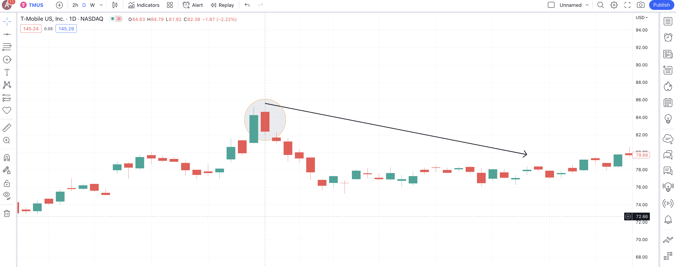
Here is the chart of T-Mobile or TMUS. On July. 29, 2019, the price of TMUS saw a long bearish candle per the Belt Hold formation. This led to a price correction.
Pattern quality
The Belt Hold candlestick pattern isn’t the most reliable and requires several confirmation candlesticks to make sense.
Preferred time frame
Daily timeframes work best for the Belt Hold candlestick patterns. However, you can even use them for accurate weekly projections, provided you pair them with RSI and volume-specific data.
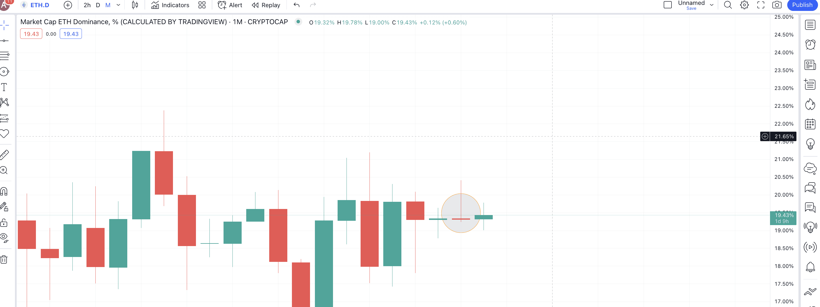
There are also two additional bullish and bearish reversal candlestick patterns to look at. These include dragonfly Doji and gravestone Doji. The Dragonfly is the bullish reversal pattern showing buyer supremacy, whereas the Gravestone Doji is a bearish reversal pattern where sellers prevail.
Here is a gravestone Doji formation corresponding to the ETH.D monthly chart, showing that ETH dominance might drop over time.
Are all reversal candlestick patterns reliable?
All the reversal candlestick patterns are reliable depending on the type of trades you want to initiate. For instance, the likes of Three White Soldiers, Abandoned Baby, and Three Crows are rarer, offer more candlestick-specific confirmations, and are fairly accurate if read correctly.
Similarly, single-candlestick formations like the Hanging Man, Hammer, and more should be paired with the likes of RSI divergence, volume data, and even chart patterns to show accurate results. Therefore, the reliability of the candlestick patterns is subjective and even depends on the location of the chart they surface at.
Candlesticks patterns and indicators are a winning combination
Candlestick patterns are great. But there is a way to make them better. Simply identify the right candlestick formation, confirm it with a chart pattern like a triangle, wedge, and whatnot, and then validate your trading setup with the likes of RSI, MACD, OBV, or any other indicator. Doing all that will help you get the best trading-specific results.
