


Today’s on-chain analysis looks at two indicators that are used to monitor the flow of Bitcoin on crypto exchanges. This data suggests that the BTC market may be entering the next phase of long-term uptrend.
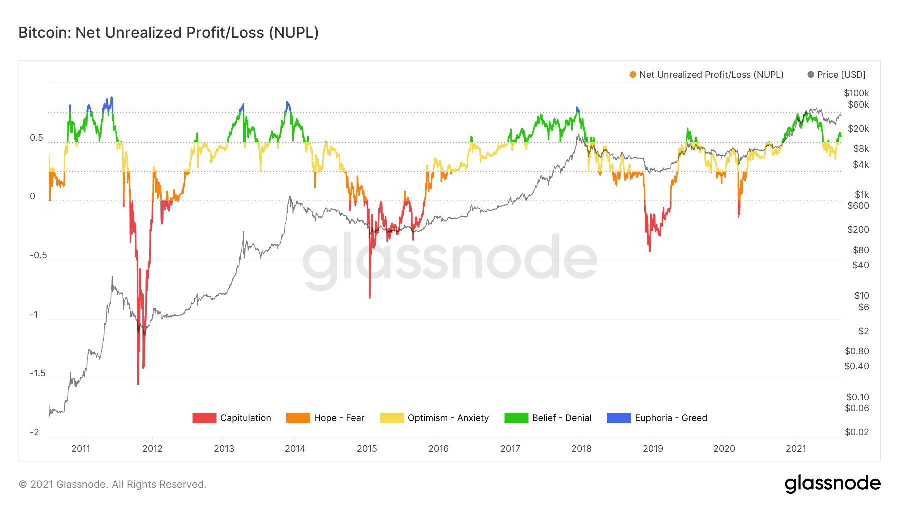
Moreover, the decisive return of the NUPL indicator to green territory above the 0.5 value increasingly resembles the double peak cycle scenario of 2013.
Bitcoin’s extreme drop on exchanges
According to data from Glassnode, the last 30 days have been characterized by one of the largest declines in the amount of BTC on all cryptocurrency exchanges. This is indicated by the Exchange Net Position Change indicator, which illustrates the 30-day change in the supply of coins in exchange wallets. If the number of coins is increasing, the bars of the indicator are green, and if it is decreasing – red.
According to on-chain analyst Will Clemente, who referenced the indicator on Twitter yesterday, 111,033 BTC has flowed off exchanges over the past 30 days. Clemente called this situation “one of the sharpest drops of exchange inventories in Bitcoin’s history”.
Indeed, if we look back at the long-term chart of the BTC price, we see only 4 similar situations (blue circles). Twice BTC’s outflows have been less than the current one (in 2017), and twice they have been greater (in 2020).
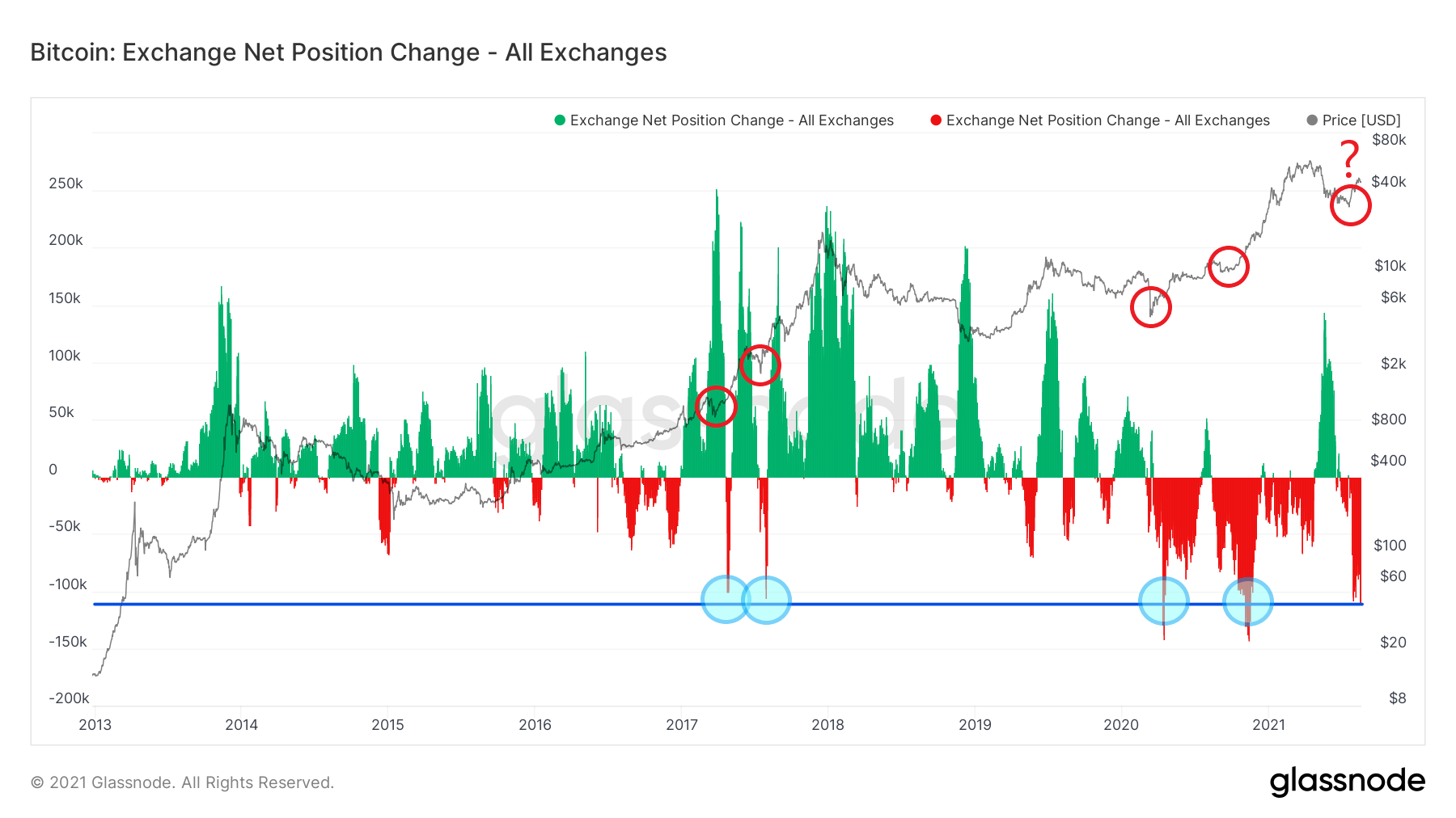
Their most important common feature is that they always occurred shortly after macro market bottoms. After such events, the BTC price never returned to these levels again (red circles).
The same trend seems to be suggested by a chart published today by Glassnode. It contains an interpretation of the Net Transfer Volume from/to exchanges indicator for its 7-day average. This indicator shows the difference in the volume of bitcoin deposited and withdrawn from exchanges.
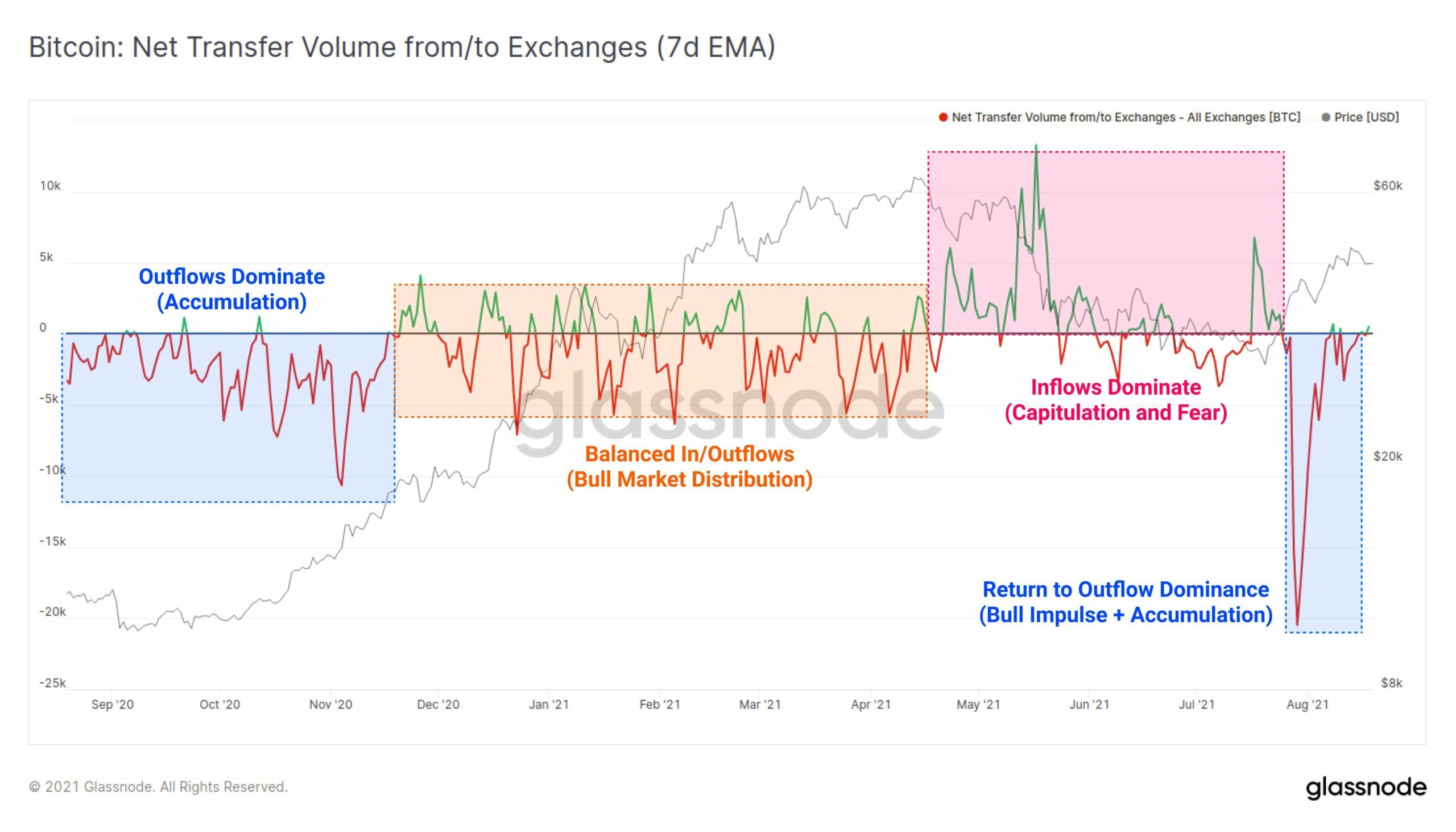
The chart suggests that the BTC market has returned to the bullish impulse and accumulation phase it previously underwent in late 2020 (blue rectangles). When green inflow readings dominated the May-July 2021 period, the market was experiencing a phase of capitulation and fear (pink rectangle).
Positive correlation of price and supply shock
Another indicator that supports the bull market continuation narrative is the Illiquid Supply Shock. It indicates a drastic increase in supply, which remains illiquid and is therefore kept off the exchanges by long-term hodlers.
The positive correlation of this indicator with the Bitcoin price was pointed out by the aforementioned Clemente. He highlighted on the chart periods of large change in the value of an illiquid supply shock (blue) and subsequent reactions of the BTC price. Declines in the indicator generated declines in the price of the main cryptocurrency (red), while its increases resulted in a higher price of BTC (green).
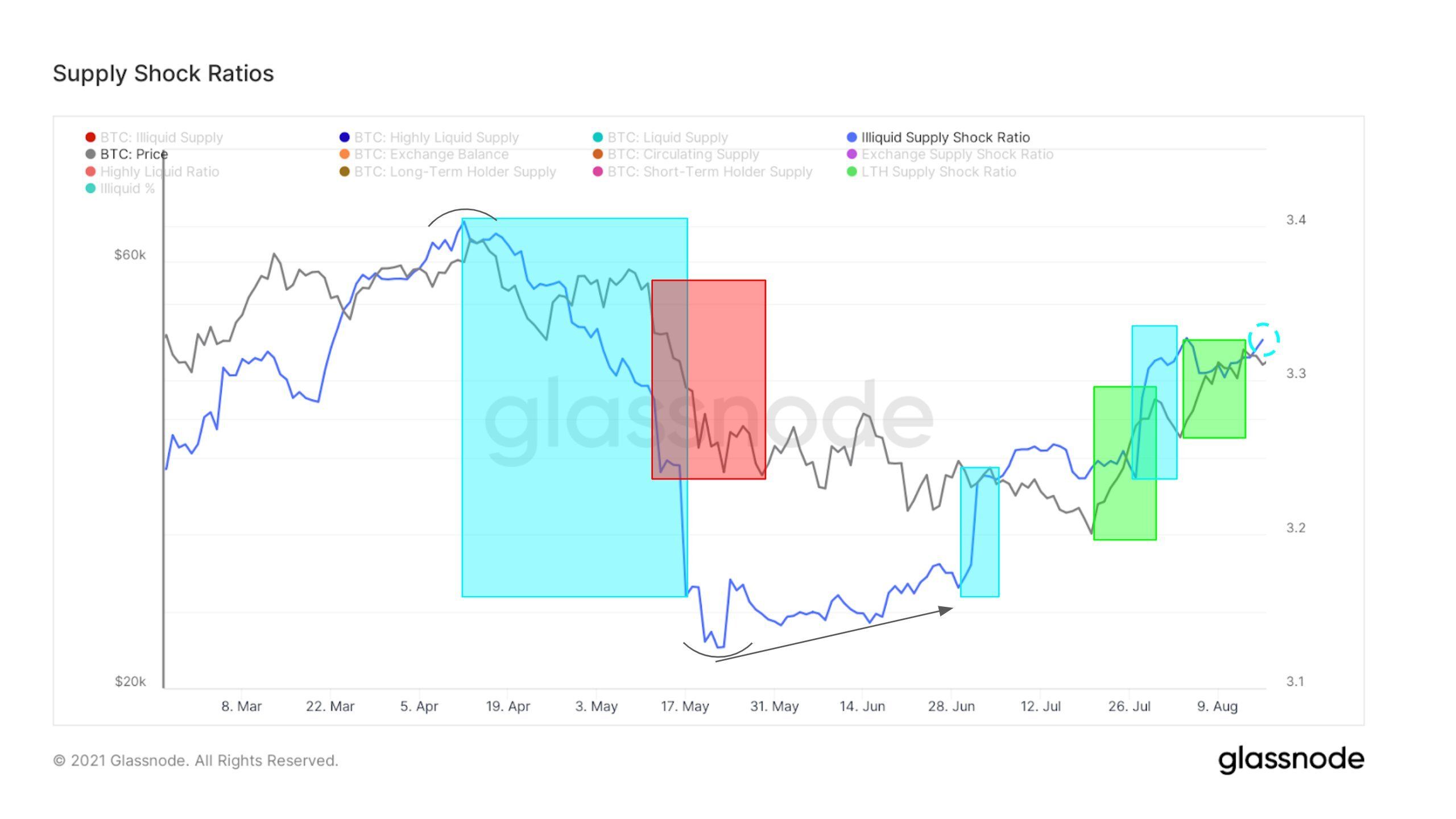
The analyst’s hypothesis is to suggest that if there is another upward move for the supply shock, then another upward impulse of Bitcoin can be expected.
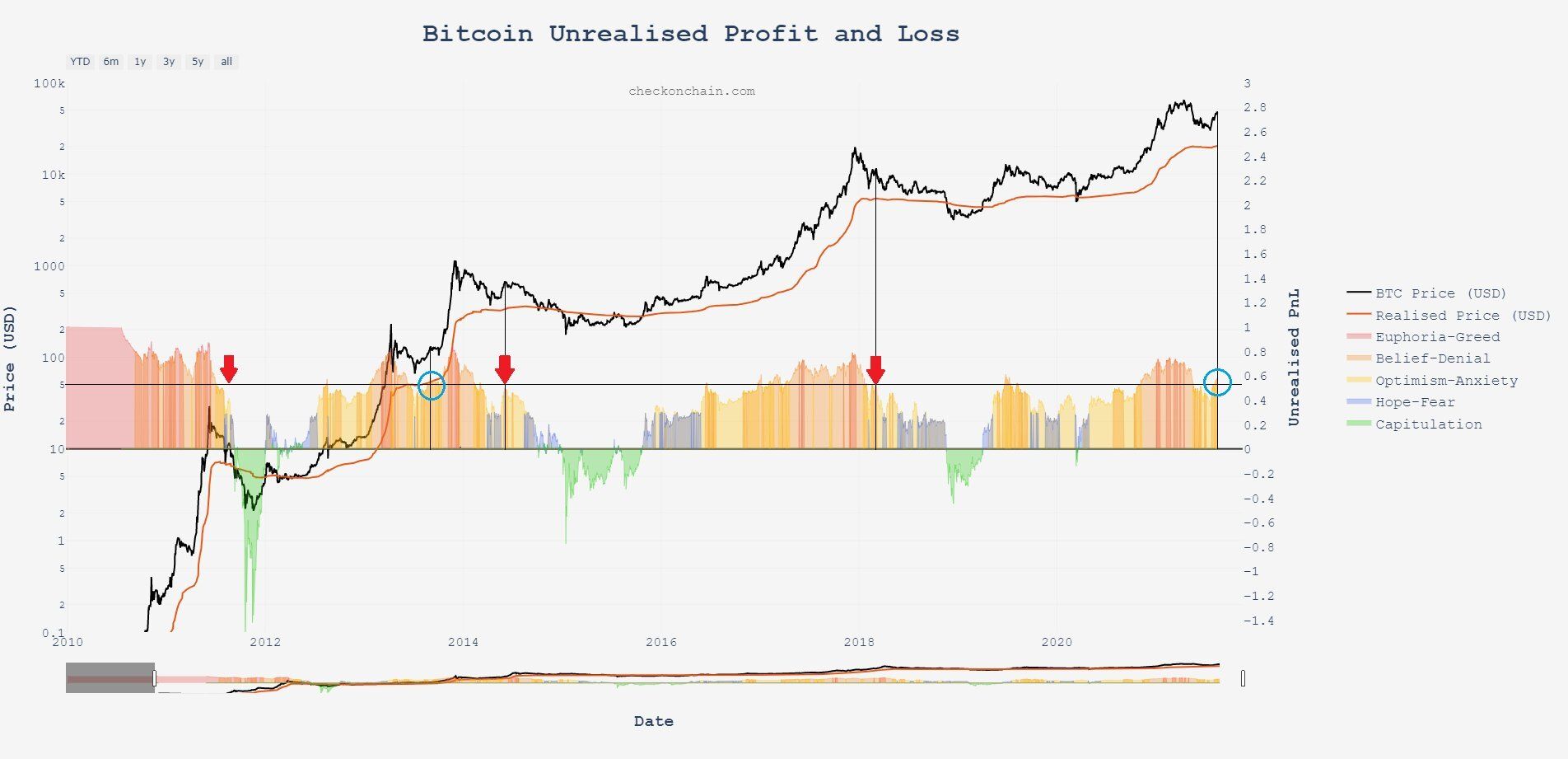
Complementary look at NUPL
In last week’s on-chain analysis, BeInCrypto looked at the long-term NUPL (Net Unrealized Profit/Loss) indicator. The return from values colored yellow (optimism / anxiety) to the green area (belief / denial) was interpreted as an argument for the continuation of the bull market for Bitcoin.
It was pointed out that the previous such situation occurred only once during the long-term bull market, namely during the double peak cycle of 2013-2014. On the other instances, a decline from the green area signalled the start of a bear market. Indeed, on the latest NUPL charts we see a definite return to the green area.
Yesterday there was a complementary look at the argument for a repeat of 2013. Crypto market analyst Charles Edwards published a chart of the same indicator, but used a different scale and bar chart.
He marked the period of NUPL’s decline below the 0.5 value, which led to the start of a bear market (red arrows). In contrast, he indicated only two situations (blue circles) in Bitcoin’s history where capitulation did not occur in an analogous situation – in 2013 and now.
For BeInCrypto’s latest Bitcoin (BTC) analysis, click here.


