


For the past few days, the price of bitcoin has been consolidating after a monumental correction, reaching the local low at $30,000. Many on-chain analysis indicators also recorded significant declines, going back to levels from before this year’s run.
In today’s analysis, we present five on-chain indicators that are now recording levels of support that played important roles in previous bull markets. In this way, they provide arguments for the thesis that a deeper correction occurs around the middle of the bull market, the integrity of which remains intact.
Bitcoin price action
The price of bitcoin has been consolidating since it experienced a monumental correction on May 19 and dropped to $30,000. The decline was a record at 53.5% for this cycle, measured from the all-time high at $64,895.
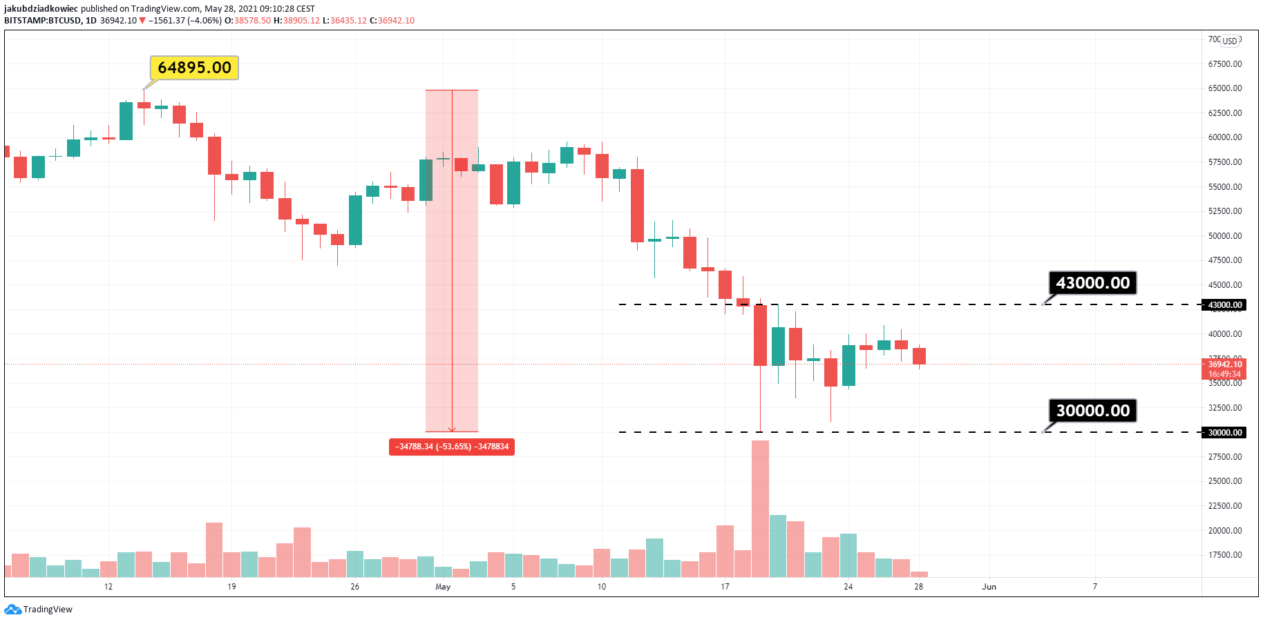
Since then, the price has respected the extensive range of $43,000 – $30,000. Over the past week, bitcoin has stabilized, tested the $40,000 resistance level twice, and is currently hovering around the $37,000 level.
There are discussions about whether such a deep correction is a signal of the end of the cryptocurrency bull run, or if looking at the current market condition, it can be considered a “healthy correction” for the overheated bull market.
The indicators of the on-chain analysis presented below seem to support the latter option and suggest that we are just in the middle of the bull market in this cycle.
Three indicators, one story
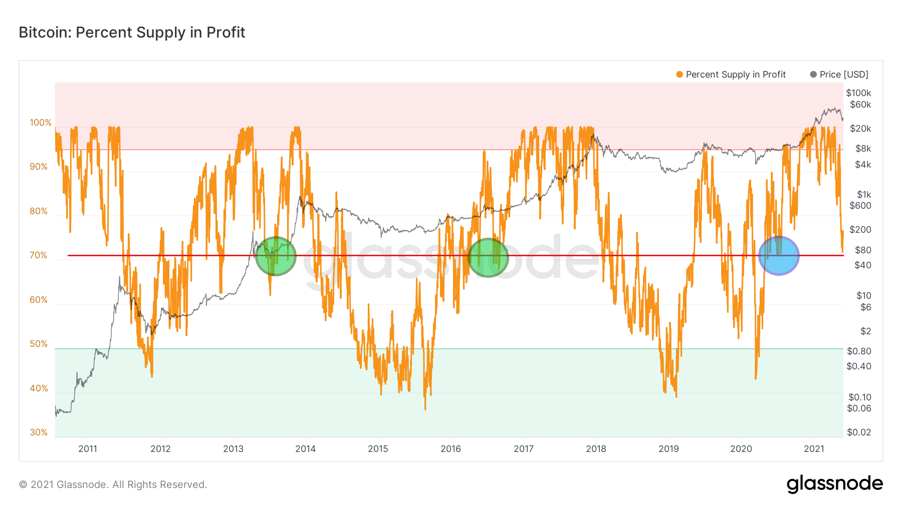
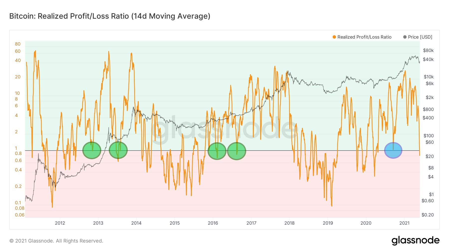
The first three long-term on-chain indicators give very similar signals: Percent Supply in Profit, MVRV, and Realized Profit/Loss Ratio. All of them are currently at levels that were crucial to hold in the middle of both previous cycles: 2012-2013 and 2016-2017.
Their charts contain three common features:
- Corrections from local peaks in the 2012-2013 cycle reached the current level (green circles).
- Corrections from local peaks in the 2016-2017 cycle reached the current level (green circles).
- The bull market in 2020-2021 started at the current level (blue circles).
Supply in Profit
The first indicator is the Percent Supply in Profit. This metric determines the percentage of circulating coins in profit, i.e., the percentage of existing coins whose price at the time they last moved was lower than the current price.
Percent Supply in Profit / Źródło: Glassnode
Currently, around 72% of bitcoins are in profit compared to the price at which they were purchased. This value was hit several times after the first local peak in 2013. It also held twice as a support after corrections between May and August 2016 (green circles).
The last time we recorded such a value several times was during the long, three-month consolidation between May and July 2020 (blue circle).
MVRV
The second indicator that tells a similar story is MVRV, which is the ratio between market capitalization and realized capitalization. It gives information about when the price is below its “fair value,” i.e., below one.
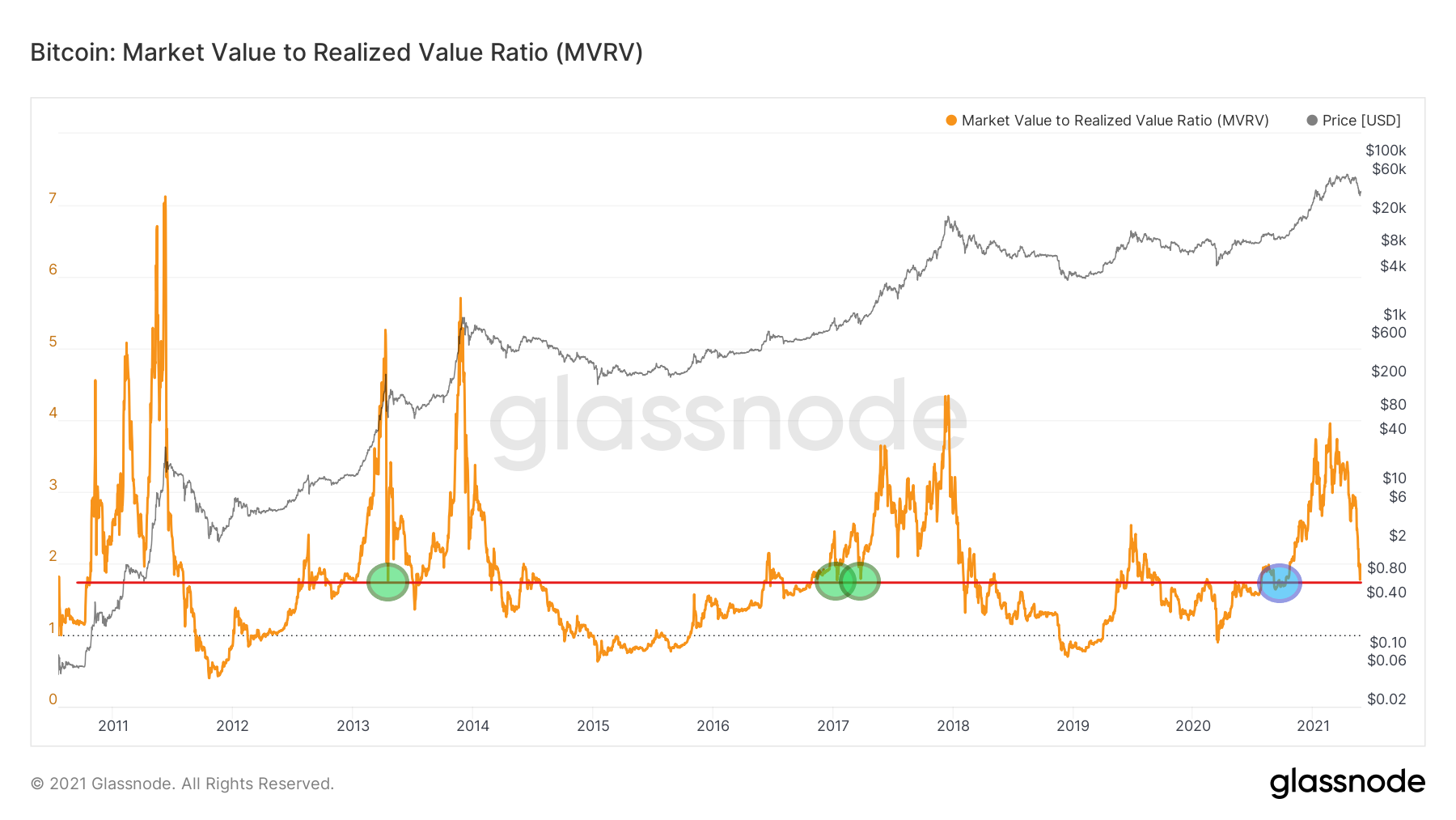
During the current correction, the MVRV approached the value of 1.8, where it dropped during the corrections of the previous cycles (green circles). In both cases, it was around the middle of the bull market, followed by an exponential phase of growth.
The current bull market also started at this level when, after the aforementioned three-month consolidation, the BTC price moved towards new highs.
Realized Profit/Loss
Finally, the third example of our on-chain analysis pattern is the 14-day average of Realized Profit/Loss Ratio. It is the ratio between all coins moved at a profit and a loss.
Realized Profit/Loss Ratio / Source: Glassnode
The current value of this indicator is around 0.8, signifying a slight loss in the market. The long-term chart shows two bullish retests of this level in the previous two cycles (green circles).
In the 2012-2013 cycle, the first retest took place before the first peak and the second after it. In the 2016-2017 cycle, both took place more or less in the middle of the bull market. This was before the main phase of growth but also before the breakthrough of the previous ATH.
Interestingly, in the case of this indicator, we also had a retest of this level during the BTC correction in September 2020. It happened as bitcoin validated its previous resistance around $10,000 as support.
Additional arguments: RHODL and Puell Multiple
Two more indicators of on-chain analysis can reinforce our narrative about the middle of the current bull market. The first is the Realized HODL Ratio. It uses a Realized Cap HODL Waves ratio and helps indicate an overheated market and possible macro peaks.
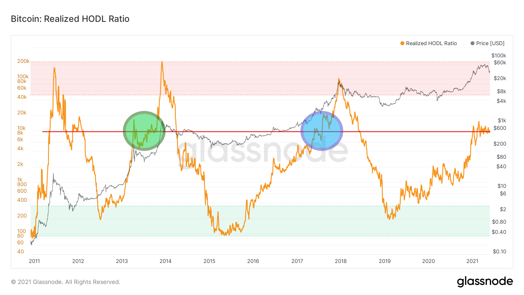
Realized HODL Ration / Source: Glassnode
The current value of this indicator fluctuates around 10,000. The sinusoidal chart is very similar to the movement from the middle of the 2012-2013 cycle (green circle). Where, after a strong increase, we had an extended consolidation.
This region was also significant in the late phase of the 2016-2017 cycle (blue circle). However, its breakthrough quickly led to the last phase of the bull market.
Finally, the last element of on-chain analysis that provides arguments for the middle of the current run is the famous Puell Multiple. It is calculated by dividing the daily issuance value of bitcoins by the 365-day moving average of daily issuance value.
This indicator helped determine the previous macro tops for bitcoin that occurred when Puell Multiple hit the red region above 4. Today, its value is just 1.1 and has dropped to late 2020 levels.
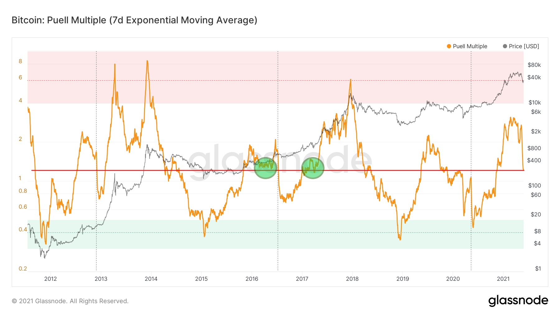
Puell Multiple / Source: Glassnode
Interestingly, in the 2012-2013 cycle, we have not reached such a low level after the first peak. However, four years later, this area turned out to be important twice.
What is more, it was even lost once in 2016 for several months and regained after. Nevertheless, it was again recorded around the middle of the cycle, and its retest allowed for a much higher BTC value at the peak of the bull market.
Conclusion
In the above analysis, we presented five long-term indicators of on-chain analysis. They all provide arguments in favor of the thesis that the ongoing bitcoin correction occurs about halfway through the current bull market.
If these levels are maintained – as in the 2012-2013 and 2016-2017 cycles – the next months may bring a strong continuation of the run and a journey towards new all-time highs for BTC.
For BeInCrypto’s latest bitcoin (BTC) analysis, click here.


