
March 12 marked the biggest daily decrease in the Bitcoin price by percentage terms. The next day, the price reached a low of $3,850 and has been increasing ever since.
The movement caused many to speculate that a very similar movement occurred in January 2015. One such analyst,@inmortalcrypto, outlined a Bitcoin chart comparing the January 2015 movement to the current one. He outlined four phases which he believes are present in both cases.
- Downtrend
- Capitulation wick
- Accumulation
- Bull trend
Fractal 2015 vs 2020
Downtrend→ Capitulation wick→ Accumulation→ Bull trend
As always, make your own conclusion.#Bitcoin pic.twitter.com/pXgx4jDfXb
— Inmortal (@inmortalcrypto) March 24, 2020
We have previously looked at this comparison from a longer-term perspective. In this article, we will take a look at the price movement after the capitulation wick to see if the recovery has been similar.
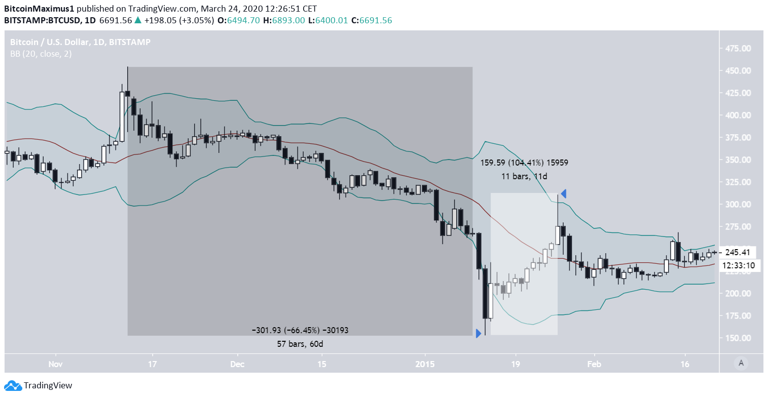
January 2015
The Bitcoin decrease began on Nov. 13, 2014, when the price reached a high of $453.92. This was the high before a 60-day downward trend that caused the price to decrease by 66.5%. The decrease culminated with a low of $152.4, which was the capitulation wick. The entire daily candlestick was below the lower Bollinger band, suggestive that the move had gone way below the regular deviation from its trading range.
A 11-day upward trend followed with a high of $309.1 being reached on Jan. 26. This wick went above the upper Bollinger band. Afterward, the price stabilized before gradually beginning an upward trend.
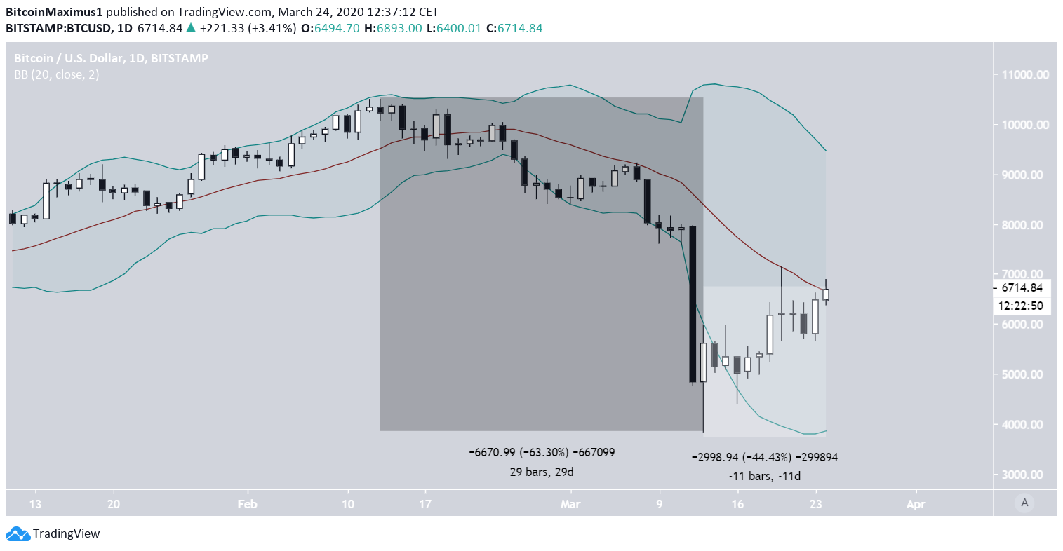
Current Movement
The current Bitcoin decrease began on Feb. 13, 2020 when a high of $10,500 was reached. This day marked the beginning of a 29-day downward trend in which the price lost 63% of its value. Comparing it to the 2015 movement, it had roughly the same rate of decrease but transpired in only half the time. The wick low of March 13 that reached a low of $3,850 was the capitulation wick, in which the entire daily candlestick went below the lower Bollinger band.The price has been increasing since, having done so by 44% in 11 days.
Therefore, we have the main difference between the two moves, which is the recovery rate, since it is more than twice smaller in the current movement. Just looking at the downward move, the opposite should have occurred, since the downward trend in 2020 was much more rapid. In addition, the price is nowhere close to the upper Bollinger band.
Still, the biggest similarity comes from the long-term movement, more specifically the relationship of the price to the 200-day moving average (MA). But, since we have covered that in our long-term article, we will not discuss it here.
To conclude, the recent BTC price decrease shares numerous similarities to that of January 2015, which marked a long-term bottom before a several year upward trend began. However, the recovery since the March 13 low has been much weaker than what transpired in 2015, allowing for the possibility that the price is not actually following the fractal but will eventually make another low.
