

The Bitcoin Rainbow Chart is a long-term visualization tool that maps Bitcoin’s historical price movements using colored bands on a logarithmic scale. While it may look playful at first glance, the chart is grounded in statistical modeling and offers a simplified view of where BTC might sit in its market cycle, without getting lost in daily price noise. It’s not a trading indicator in the traditional sense, but a bird’s-eye valuation model that helps long-term investors gauge potential market phases. Here is everything you need to know in 2025.
KEY TAKEAWAYS
➤ The Bitcoin Rainbow Chart is a long-term BTC valuation technical analysis tool.
➤ It visualizes BTC’s historical price trends and provides insights into Bitcoin’s potential future by plotting the asset’s long-term price movement on a logarithmic scale.
➤ While the chart can give a visual representation of different market phases using its colored bands, it is not a foolproof indicator for predicting BTC’s future price and should be used in tandem with other technical and fundamental indicators.
- What is a Bitcoin Rainbow Chart?
- The history of the Bitcoin Rainbow Chart
- Bitcoin Rainbow Chart: pros and cons
- Logarithmic regression underpins the rainbow
- How does the BTC Rainbow chart work?
- Reading the Bitcoin Rainbow Chart
- Supporting indicators for the BTC rainbow indicator
- Bitcoin Rainbow Chart vs. stock-to-flow
- How reliable is the Rainbow Chart?
- Rainbows and sunshine: How we look at BTC
- Frequently asked questions
What is a Bitcoin Rainbow Chart?

The Bitcoin Rainbow Chart is a tested and mathematically credible tool that uses colored bands to determine key trading zones.
Unlike other trading charts, the BTC rainbow chart superimposes the historical price pattern on a rainbow-like logarithmic chart — cutting out volatility and misinformation in the process.
Way too much jargon? Here is a simplified version: Remember exponential growth? A line/ chart that starts slowly and peaks after a certain level.
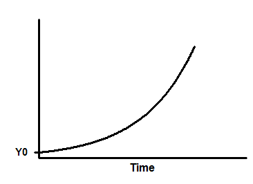
Now consider an inverse of this — a logarithmic line that starts fast and continues to flatten out over time. Furthermore, both exponential and logarithmic lines continue to move away from the X-axis — changing the peaks and throughs for every bull/bear cycle.
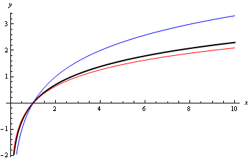
The Bitcoin Rainbow Chart uses the logarithmic scale to plot the asset’s potential long-term price movement,
Why the Bitcoin Rainbow Chart?
Bitcoin came to fruition in 2009, amid glaring concerns and a hotbed of volatility. And while most technical analysis tools like moving averages, Bollinger Bands, etc., were used to determine the buy-sell levels, navigating price fluctuations continued to be challenging.
Challenges like these beckoned the need for a scientifically vetted tool that would give a bird’s-eye view of the BTC price action. The Bitcoin Rainbow Chart filled this gap, helping users plan their long-term trading and investing gigs.
Elements of a Bitcoin Rainbow Chart
The BTC Rainbow chart comprises multiple colored bands — blue, the lowermost band, and dark red, the uppermost band.
Here are all the elements of a rainbow chart and what they mean to you as an investor:
- Dark Red: Extreme FOMO, likely to dip/bubble territory
- Red: Overbought zone; profit booking advisable
- Dark Orange: Buyers in charge and FOMO building rapidly
- Light Orange: Balanced territory with buyer-seller impasse
- Yellow: A BTC HODLer territory
- Light green: BTC price currently in the buy zone
- Green: Price sale ongoing; accumulation zone
- Light blue: Evident buy zone
- Blue: Bearish run at the counter
As seen, each band means something or the other to investors.
The history of the Bitcoin Rainbow Chart
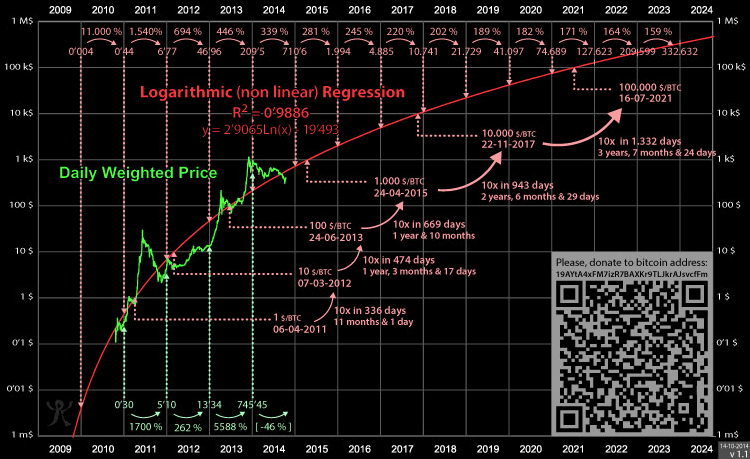
The rainbow chart considers historical and current prices for plotting. However, the chart itself has a history. The BTC rainbow chart was the brainchild of Azop (a Reddit user), who introduced the indicator in 2014.
It started as a fun chart but quickly attracted eyeballs. Once the chart became popular, Trolololo — a Bitcointalk user — paired it with Logarithmic Regression — giving it form and purpose in the process.
Here is the official version of the Rainbow Chart, featured on Blockchaicenter.net. Just so you know, a third player— Uber Holger— fine-tuned and developed the chart further, eventually uploading the same on the Blockchain Center.
Bitcoin Rainbow Chart: pros and cons
The BTC rainbow chart is a powerful tool. Yet, like any other chart-specific resource, it has its share of pros and cons:
Pros:
- Have been accurate since the launch
- Uses a credible statistical model (logarithmic regression)
- Handy when it comes to looking at the long-term price development sans the noise (volatility)
- Easy to understand, even as a standalone indicator
- Devoid of daily volatility and noise
Cons:
- Not fit for gauging short-term price trends
- The chart needs more time to mature
- Not a future price predicting tool
Logarithmic regression underpins the rainbow
Logarithmic regression is a statistical modeling technique used to evaluate a rapidly growing/decaying process that slows down over time. Growth of infants, the acidity of a solution, and sound intensity as some of the functions best represented by logarithmic regression.
Simply put, it is a method used to analyze and establish relationships that a standard linear line cannot represent. In the case of Bitcoin, the price of BTC (massive initial growth) and the elapsed time cannot be related via a linear line, calling for the need for logarithmic regression.
So, how does logarithmic regression fit into the rainbow chart narrative?
The original chart— released by Azop — was all about color coding the price action, as part of a linear line. The logarithmic regression chart from Trolololo combined nicely with Azop’s chart — developing the insight-filled rainbow chart we currently use.
Chart without Logarithmic regression:
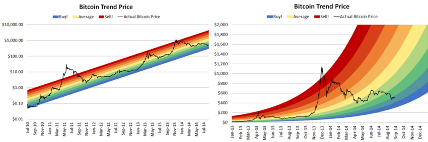
See how the price moves 10x, and the days for achieving the same keep going up. That is what we call flattening/slowing growth.
How does the BTC Rainbow chart work?
The rainbow chart has the following uses:
- As a standard band-specific investment zone predictor
- Determining price reversals when used with moving average indicators
- Finding the profit booking zone, provided you use it with specific trend indicators
- Outlining potentially overheated (overbought) zones
- Discovering potential future in terms of accumulating BTC at discounted prices
If you plan to use the Rainbow Chart as it is, you can get a broader picture by looking at the price and which color band it is currently housed in. More about that in the next section.
Reading the Bitcoin Rainbow Chart
Reading the Bitcoin Rainbow Chart is easy. As it uses historical price data, you can see that every price move since 2014 would fall in a specific region(s) of the rainbow chart.
Right in the middle, we have the central yellow zone, which serves as the starting point of the chart. Color bands over and under the yellow band are termed deviations.
As BTC moves into the warmer zones (reds and oranges), investors start considering the prices to be in the bubble territory. Profit booking usually follows when BTC rests in these warmer zones for a while.
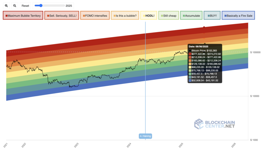
While the chart doesn’t offer precise entry/exit points, it gives a historical frame for long-term sentiment and investor behavior. Understanding which band Bitcoin currently sits in can help assess whether the market leans toward discount, fair value, or exuberance.
Supporting indicators for the BTC rainbow indicator
As powerful as the rainbow chart on its own, it works even better with the following indicators:
1. Volume indicators
Sideway movements on the rainbow chart are quite common. In the long term, the prices do not always drop or surge at a moment’s notice. Therefore, as an informed investor, you might consider pairing the rainbow chart with a volume indicator to preempt the dips, surges, and pullbacks.
On Balance Volume and Accumulation and Distribution indicators are the best volume-specific tools to use with the rainbow chart.

On Balance Volume as the low-dwelling blue line and Accumulation and Distribution Indicators as the green line.
2. Trend indicators
Trends can help you fine-tune long-term investment strategies. For instance, if you know where the price is heading in the short term, it is possible to use the rainbow price bands better. For instance, if the trend signifies rangebound price action, it is better to hold your horses as the price, even on the Rainbow Chart, will be moving sideways for a while.
In case of an uptrend, where the price (in the short-term) scales higher highs, there might be a sharp move up from the existing color band or even within the same color band.
The RSI (Relative Strength Index), Bollinger Bands, and MACD (Moving Average Convergence/Divergence) are some more reliable trend indicators to go with the rainbow chart.

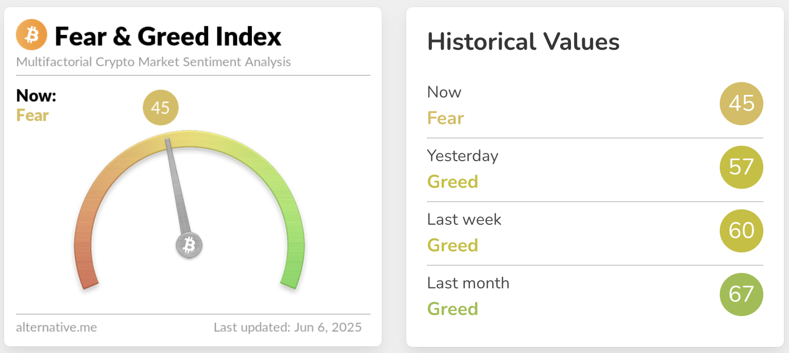
3. Sentimental indicators
The Rainbow Chart works particularly well with the Bitcoin Fear and Green Index — an indicator that measures social sentiments, short-term price volatility, market volume, search trends, and market dominance.
Bitcoin Rainbow Chart vs. stock-to-flow
The Bitcoin stock-to-flow chart is yet another reliable price forecasting indicator. However, it differs from the Rainbow Chart across a few key aspects.
While the Rainbow Chart considers the historical prices and logarithmic regression to determine a fair value zone for those prices, the stock-to-flow model takes the price and BTC scarcity into account.
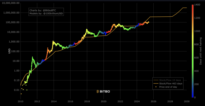
The stock-to-flow chart for BTC comprises two major factors: the stock or the total BTC supply (21 million) and the flow or the periodic mining rate.
Unlike the BTC Rainbow Chart that follows a price-based model, stock-to-flow takes the Bitcoin halving cycles into consideration. As BTC mining rewards reduce by half, the stock-to-flow ratio is expected to increase (as flow reduces). Therefore, the stock-to-flow ratio increases with each halving, taking the prices higher with it.
Simply put, the BTC rainbow chart focuses on the price, whereas the stock-to-flow chart focuses on scarcity. This point of view is what relates Bitcoin to a commodity.
How reliable is the Rainbow Chart?
The Rainbow Chart has been accurate since its inception. To date, the prices haven’t skewed away from the concerned zones, be it during the bull market or during the bearish phases. To verify, you might cross-check the price forecast from the stock-to-flow model during any halving cycle and see which zone the price belonged to during that time.

White horizontal lines are the halving points. Notice how discounted the BTC prices were during the halving cycles and how they moved up after the event.
Rainbows and sunshine: How we look at BTC
In summary, the Bitcoin Rainbow Chart is effective when it comes to forecasting long-term price movements. It tracks market sentiments, segregates price moves into specific zones, and has been fairly accurate to date. You can pair the chart with other indicators for a mid to long-term price forecasting resource.
However, we wouldn’t go out on a limb and urge you to use this chart to predict the price of BTC. Instead, you are better off using it to track the overbought and oversold nature of the Bitcoin ecosystem. And as they say: it takes sunshine (bull market) and rain (bear market) to make a rainbow.
Disclaimer: This article is for informational purposes only and should not be considered investment advice. Always do your own research.
Frequently asked questions
Is the Bitcoin Rainbow Chart reliable?
Is Bitcoin becoming less volatile?
How does the Bitcoin Rainbow Chart work?
What is a Rainbow Chart?
Disclaimer
In line with the Trust Project guidelines, the educational content on this website is offered in good faith and for general information purposes only. BeInCrypto prioritizes providing high-quality information, taking the time to research and create informative content for readers. While partners may reward the company with commissions for placements in articles, these commissions do not influence the unbiased, honest, and helpful content creation process. Any action taken by the reader based on this information is strictly at their own risk. Please note that our Terms and Conditions, Privacy Policy, and Disclaimers have been updated.