In today’s on-chain analysis, we are trying to answer the question of whether there are reasons to fear the ending of the ongoing Bitcoin bull run. We are looking at the activity of long-term hodlers who stopped selling their coins again in the last week.
Futures contracts recently recorded an all-time high, but their relation to the spot positions points to a healthy reset. By contrast, the long-term HODL Waves and Dormancy Flow indicators – which have historically provided accurate peak signals, indicate that there is still plenty of room for bitcoin growth.
BTC price action
Bitcoin hit a new all-time high of $ 64,895 on April 14. Currently it is experiencing a correction. While attempting to validate the previous breakout area as support.
Thus, the BTC price is currently trading in a large range with support at $55,864. With daily close resistance at $ 63,581.
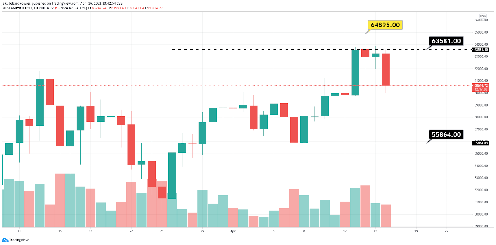
Despite reaching the new all-time high, the Bitcoin volume still seems to be in a downtrend. This is a signal that the volatility of the main cryptocurrency is stabilizing and a large price movement either up or down is still ahead of us.
Hodlers no longer selling
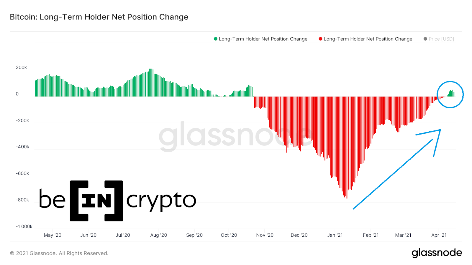
The first indicator of on-chain analysis that shows a clear change in the behavior of long-term investors is the Long-Term Holder Net Position Change. Since January 2020, we have seen a significant decrease in their sales activity (blue arrow).
However, in the last week this indicator started generating green bars again (blue circle). This means that most long-term investors are no longer selling, but accumulate their positions in anticipation of further increases.
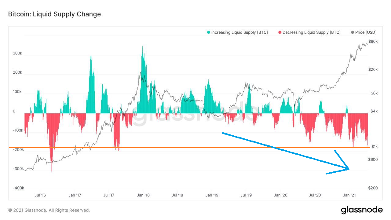
Confirmation of this trend can be found in another Bitcoin indicator: Liquidity/illiquidity supply change. It turns out that the liquidity crisis of the main cryptocurrency, which started around mid-2019, is only gaining momentum and is currently reaching new highs.
The long-term chart of the supply illiquidity indicates that holders are accumulating, with short breaks for taking some profits. Twitter user @DocumentingBTC points out that this is a trend unprecedented in the history of bitcoin. Which affects both individual investors and institutions:
The opposite tendency is visible in the inverse indicator. Which shows the change in the liquidity of supply. The decline is visible since mid-2019 (blue arrow), and the current levels (orange line) are comparable to the Q3 of 2017. The period just before the exponential increase in the previous bull market.
Futures reach an all-time high
As the Bitcoin price rises, the value of futures contracts also increases drastically, reaching all-time high again. The chart from Glassnode shows that the total value of Futures Open Interest on major cryptocurrency exchanges has exceeded $ 27 billion.
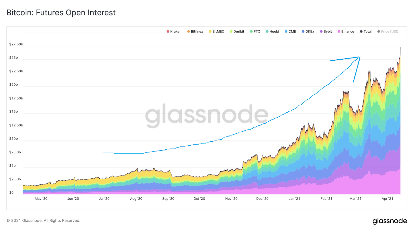
The growth curve has become parabolic (blue arrow) and signals that the market is increasingly heated. However, an interesting view is provided by the chart of Futures to Spot volume ratio. This was recently published by the on-chain analyst @Negentropic_:
It turns out that during the recent Bitcoin consolidation, this indicator has cooled significantly. Currently, it has reached the level typical for the short periods of this bull run, which preceded the strong increase in the BTC price (green circles).
Bitcoin top is not in
In the context of the ongoing discussion of the potential Bitcoin top, which was recently triggered by the cross of the infamous Pi Cycle Top indicator, it is worth taking a look at two more long-term on-chain charts.
The first is HODL Waves, which BeInCrypto has recently discussed in detail.
Below we see a HODL Waves chart weighted by a Realized Cap. We see historic highs for this indicator (blue rectangles) that coincide with the bull market ending parabolic increases in the BTC price.
These were the periods of maximum Bitcoin sales by long-term hodlers (smart money) to retail investors, FOMOing into the market (dumb money).
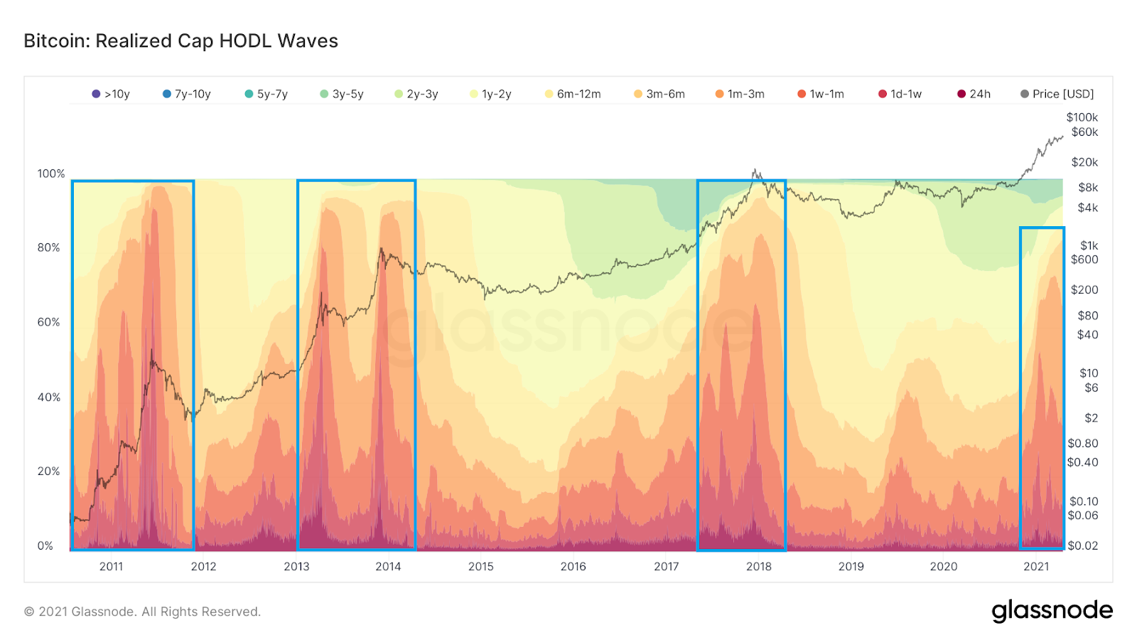
While we see increases in the red and orange areas, we are still not even close to the peaks of previous cycles.
This is confirmed by the second indicator, Entity-Adjusted Dormancy Flow. It is the ratio of the current market cap and the annualized dormancy value in USD and can be used to determine the lows and highs for the BTC price. The more old coins are sold, the more this ratio increases.
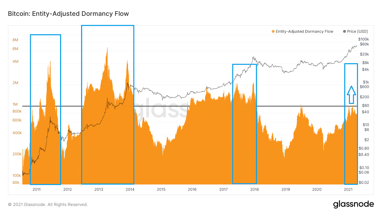
The historical chart of this indicator also shows room for increases for bitcoin (blue arrow). We are not even close to the 2017 peak. The historic all-time high of 2013 is still a long way off.
Conclusion
The deepening Bitcoin liquidity crisis, record value of Futures on cryptocurrency exchanges and long-term charts of investor activity confirm one common picture of the current crypto market.
The bull market is accelerating. The indicators are fairly heated, but there is still a lot of room for further increase.
Despite some red flags, it is clear that this is not what the bitcoin top looks like. We will have to wait a little longer for this to happen.
For BeInCrypto’s previous Bitcoin (BTC) on-chain analysis, click here.


