
For those new to cryptocurrency and trading, even the basic interface of an exchange or candlestick chart could look intimidating at first. That’s why BeInCrypto has created a useful guide for navigating your way through the ins and outs of the Stormgain platform, even if you’re completely new.
Know that what you learn here will be highly similar to what you should find on almost any exchange or market chart. This is meant to be a broad overview for beginners, but know that in future articles we will explore all of these aspects more elaborately.
The Main Interface
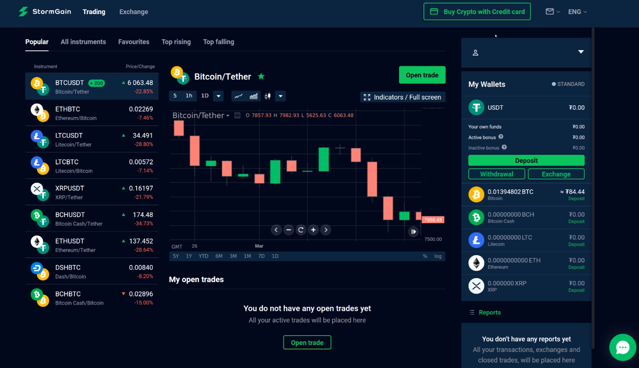
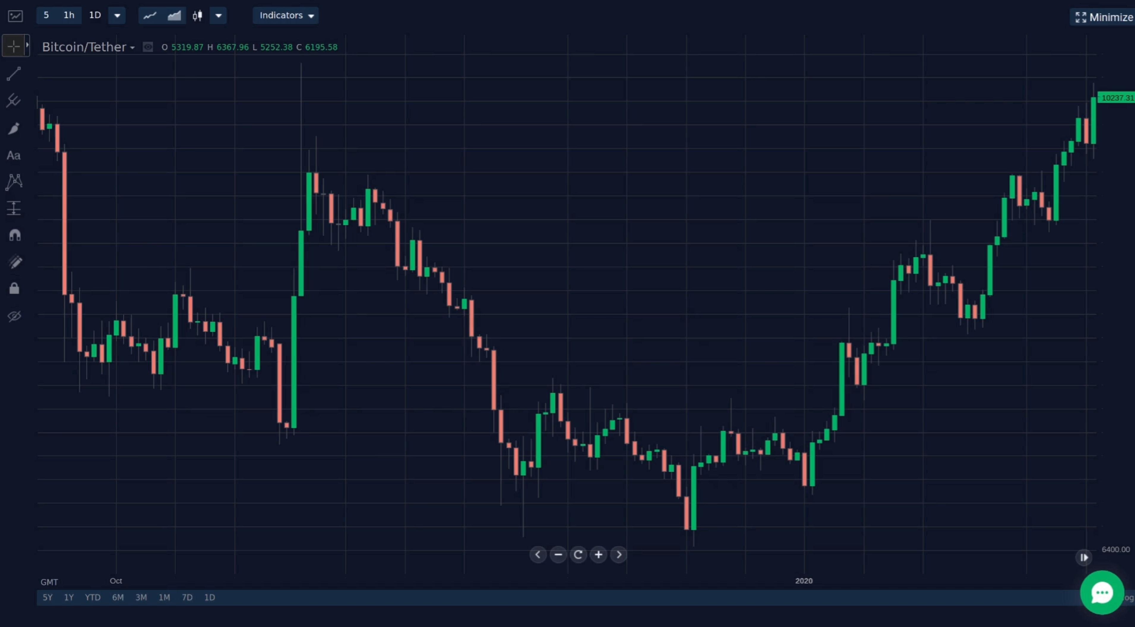
The primary thing you’ll see upon logging in is a screen very much like this one. On the left you will see the variety of trading pairs, and at the bottom are your open trades (which is plausibly empty if this is your first time).
On the right-hand side you can see your wallet balances, which again are likely zero at this time. The most obvious thing, of course, is the chart that should be right in the middle. This chart is where we will be spending most of our time today, but first a few notes on some of the other elements.
Trading Pairs
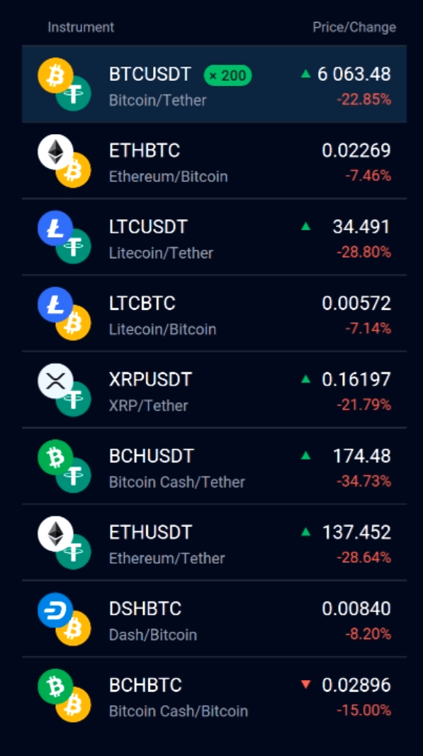
The trading pairs you see on the right act as shortcuts to bring up the market indicated. Stormgain has many popular digital assets available in addition to Bitcoin, such as Ethereum, XRP, Litecoin and Dash, just to name a few.
Notice that there are tabs for sorting the pairs, and if you click on “All Instruments” you can get a complete list of literally everything available. Also take note that all the pairs presented here will be matched wither with Tether (USDT) or Bitcoin (BTC). It will be important to be aware of which pair you are looking at when making trades, so it doesn’t hurt to familiarize yourself with it now.
My Open Trades
Again, this area won’t have much going on just yet, but when you do begin making trades, the “My Open Trades” window is where you will be able to keep an eye on your orders, click on them for more information, and even cancel them.
You can begin a new trade by clicking on “Open Trade,” though explaining that system will have to wait until later. Generally speaking, exchange interfaces should make it clear where you can view and track your active trading.
Wallets
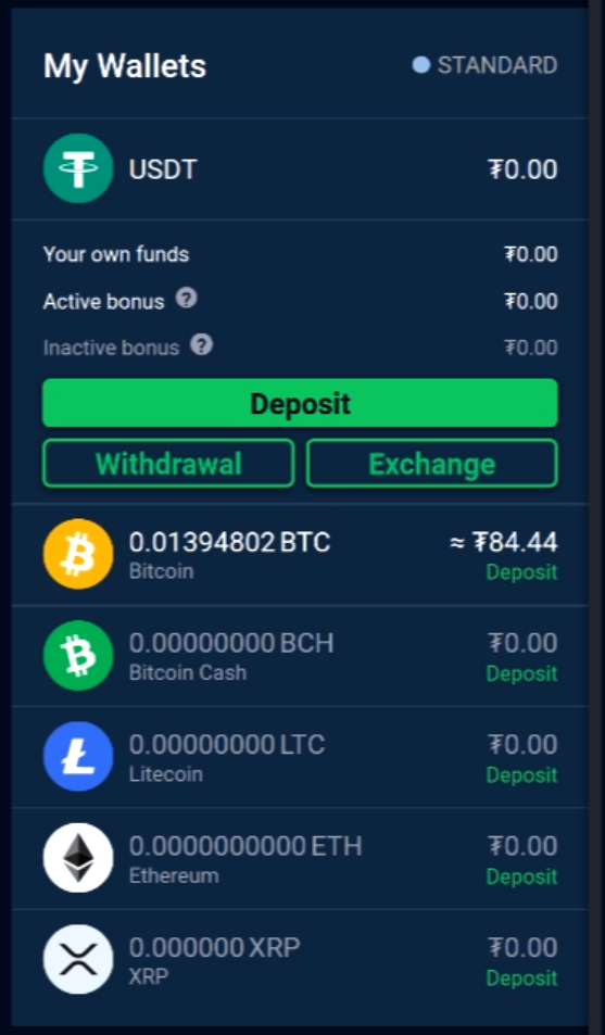
Wallets, as you probably know, are where you can store your cryptocurrency. Stormgain offers wallets for every asset you can purchase on the platform, and each one will display how much of the asset you currently have. Furthermore, they can be clicked on for additional information as well as for “deposit” and “withdraw” options.
There are a few things to note about wallets. One, is that funds should only be stored on an exchange for short periods of time, unless they’re actively being traded. Exchanges shouldn’t be treated like banks, even for reputable ones like Stormgain.
For longer holding, something like a cold storage wallet may be in order. One other thing to note is that while most of these wallets work specifically for the asset they are designated to, there is a nuance about the Tether wallet.
It’s too much to get into here, but know that Stormgain uses Omni Tether, which is one of multiple varieties. The important take away is that is you are depositing Tether to this platform, take the time to check which version you are using.
Other Important Things to Note
On the bottom right is the “Reports” window. Here you will basically see the history of your transactions and trades. This can be invaluable information especially if you are tracking your long term profits and losses. There won’t be anything here yet, but be aware that again, every exchange should offer a place for you to review your history, some with more features than others.
Next to reports is a chat bubble, which will open up a dialogue box for customer support. A solid exchange shouldn’t take too long to respond, but this will, of course, vary with the workload. In the top left you can switch between the trading window and exchange window, but don’t worry too much about this distinction just yet.
Opposite this on the right are tabs for messages, language and profile options, all of which are pretty standard. Lastly, many exchanges including this one offer options for purchasing with a credit card, and this will usually be visible as an option on the main screen.
The Chart
This is, in many ways, the star of the show on many exchange interfaces. The chart is simply a visual history of price action for an asset over a specific time period. There are many different types of charts, but the most common you will find are line charts, volume charts and candlestick charts.
We’ll be focusing on candlestick, but just know that line charts and volume charts are similar and show the price fluctuations as simply a line. While this can be just fine, many traders find that candlestick charts offer more insight for technical analysis, so we’ll take a closer look at candles now.
Just remember, most exchanges will give you an option to switch between chart types and this is usually located along the top of the screen.
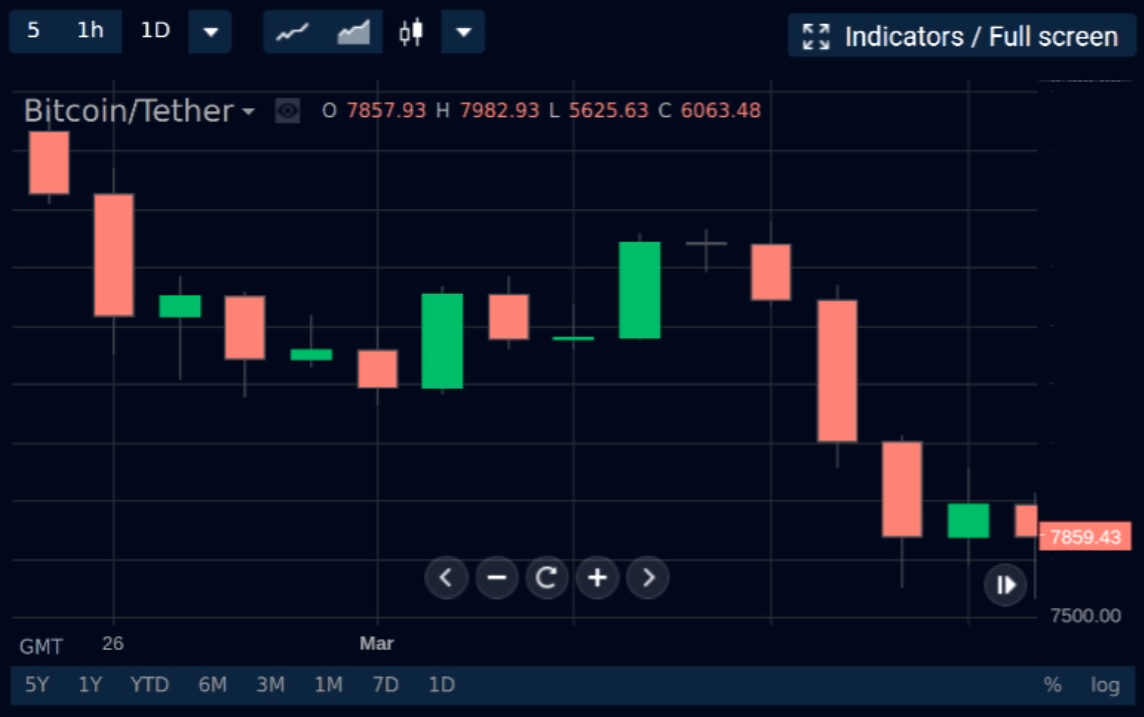
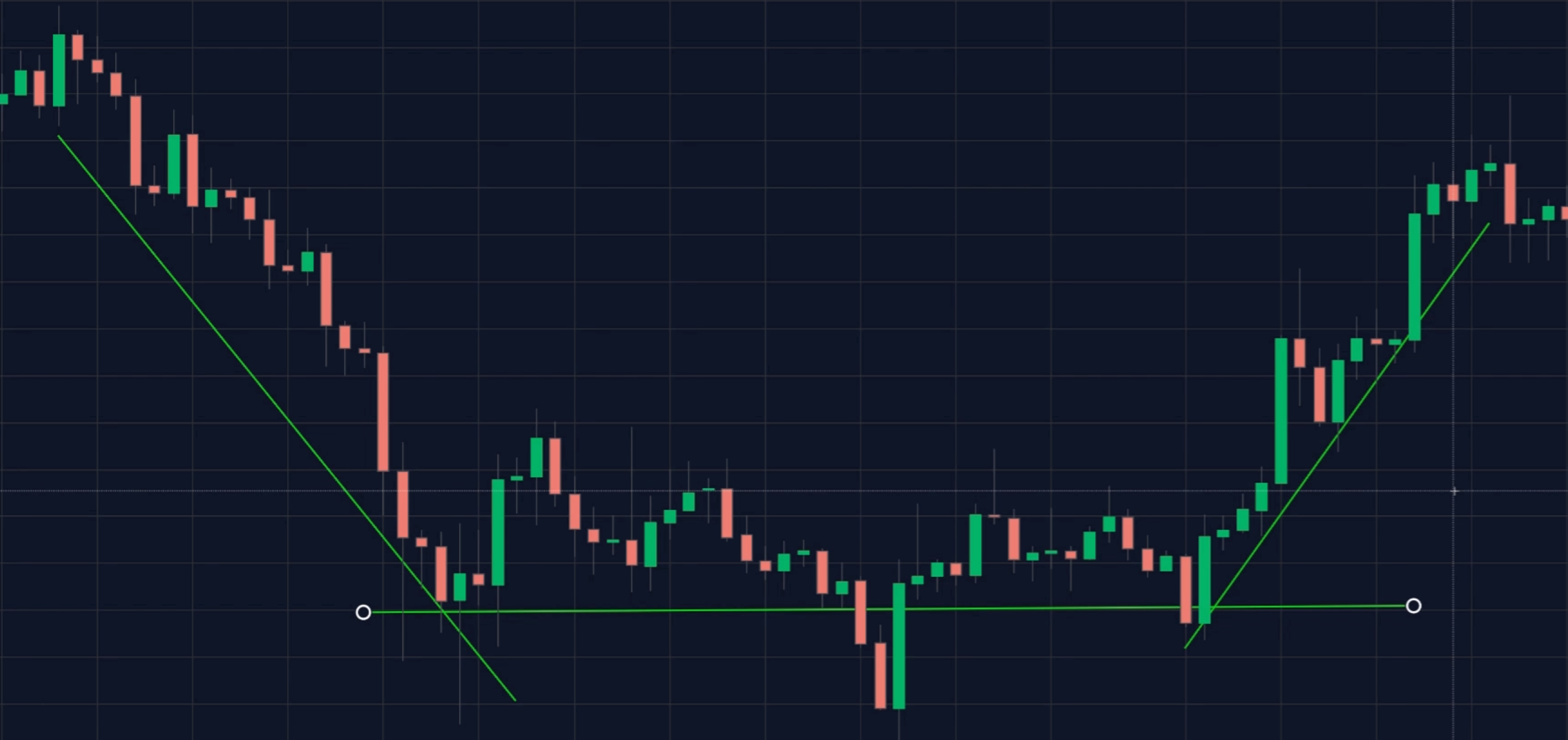
What Do Those Candles Mean?
Each candle on the chart represents a discreet unit of time. This also can generally be adjusted using tools located at the top of the chart, but common time frames include 1 day, 1 week, 4 hours, 1 hour, even 15 minutes. Most of the time you will find even more options than this, though some platforms will limit you to just a few different units.
Now let’s say that our chart is set to 1-day intervals. That means each candle represents the price movement for a 24 hour period. If the candle is green, then it represents a day where the price ended up higher than where it began, and red would be just the opposite.
The “body” of the candle represents the opening and closing prices, and hence if it is green then the bottom would be open and top the close. Of course, this gets reversed if the candle should be red.
The little “wicks” that tend to stick out of the top and bottom of candles are the highest and lowest price that were touched during the time interval. For quick reference, all of the numbers for the currently highlighted candle should be reflected at the top of the chart next to the letters “O H L C” for “Open,” High,” Low,” and “Close.”
This makes it easy to see the numeric values for each candle without having to “eye ball” it from the chart.
Adjusting How the Data Is Displayed
There will generally be a few different ways that you can toggle how this information is shown to you. There are actually a great many ways to adjust the data on screen, but we’ll stick to the most common. One is that you should be able to adjust the full time frame that is represented in the window, which can be massively beneficial for viewing longer and shorter trends.
In the bottom left you can see buttons to jump to specific time periods, such as 1 day, 1 month, 6 months, 1 year, 3 years, all time, just to name common ones.
Additionally, if you look to the bottom right, you can see buttons to toggle how data is displayed on the Y axis as well. By clicking on the “%” you can represent the price as a percentage change over the time portrayed in the window, which can be very helpful to quickly identify gains or losses.
Next to this is the button to change to the logarithmic scale, which is great for looking at longer periods of growth. By setting your chart to “log,” the Y axis will no longer be linear, but instead each tick will represent a ten-fold increase in price.
This can make it notably better at displaying data for assets that see exponential growth, which is certainly helpful for looking at most cryptocurrencies.
Switching To a Full Chart
Often the chart shown in the main interface of an exchange is actually just a simplified version, and this is in fact the case on Stormgain. By clicking on “Fullscreen/Indicators”at the top right of the chart, we can bring up a much larger chart and one that has an array of tools and indicators for us to learn about.
Deeper exploration on all of these will have to wait for a future article, but generally your chart should have a “tools” bar, often on the left side of the display. This is where you’ll find options to adjust your cursor, create basic lines, draw freestyle on your chart, add text or other notations, mark specific entries/exits for trades, and much more.
Generally speaking, tools are things you will be overlaying onto your chart to clarify patterns or search for trends. They can also be invaluable when sharing charts with others, in order to make it clear what it is you are trying to convey.
In a similar vein there are indicators. Indicators are more complex than just tools because they are algorithms that take the market data and reinterpret it in some way to try and eke out extra information where the price may be going.
It is not always obvious how they work, so they may take a bit of education in order to apply correctly, and there are hundreds of variations of them. Different exchanges will vary to a degree, but some of the most popular indicators include Moving Averages, RSI, MACD, Bollinger Bands, and Volume.
Spotting Your First Trends
Trends make up a large aspect of analyzing the market. There are truly only three types of trends: up, down or sideways. That being said, they can still take many form, last for variable amounts of time, and change with sometimes little warning.
The trick to knowing when a trend may change comes both from understanding the broader market, as well as watching for what’s known as a “reversal pattern.”
These patterns are never guarantees, but certain formations of candles that tend to come before a shift in market momentum. They can be very useful when understood, but of course our dive into reversal patterns will have to wait for a future article.
A Lot More To Learn
That should cover the basics for you to learn the first time you see an exchange interface. Hopefully, this has helped you to feel more comfortable with some of the features, options, and more importantly, the candlestick chart.
These charts are where you’ll likely be spending a lot of time if you’re going to be making trades, or even just passively investing. That being said, we have barely begun to scratch the surface. In addition to tools and indicators, you’ll want to learn about trends, reversal patterns, strategies and leverage if you want to get everything out of the Stormgain exchange.
We’ll be discussing all of these things and more in future editions of this tutorial series, so be sure to come back and check those out too in order to master the skills needed for cryptocurrency trading.
To find out more about trading and analysis; you should consider becoming a BeInCrypto Premium member.
