Today’s on-chain analysis from BeInCrypto attempts to estimate the market stage based on an analysis of the number of new Bitcoin addresses and the percent of entities in profit. The on-chain data indicates that individual “retail” investors are not yet the dominant force in the market.
The decline in the number of new addresses and the decreasing number of entities in profit are strong signals that the market is far from the FOMO typically seen at the end of a bull market. At the same time, both indicators are providing bullish divergences to suggest that the uptrend in the crypto market may soon continue.
Bitcoin Google searches falling
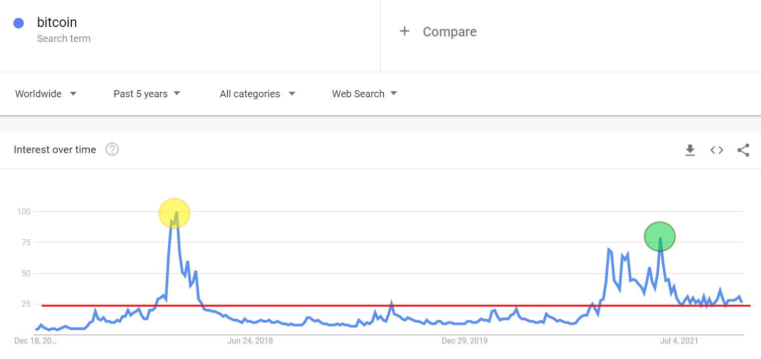
One of the easiest ways to measure the hype around the cryptocurrency market, and Bitcoin, in particular, is the Google Trends tool. It can measure the search rate for the phrase “Bitcoin” in a set region and time period. The end of the bull market from the previous cycle coincided with a record level of searches for the phrase “Bitcoin” worldwide, which reached a maximum value of 100 (yellow circle) in December 2017.
During the current bull market, the Google Trends chart peaked in May 2021 at a value of 79 (green circle). Since the beginning of July, the indicator has been moving back to the range of 24-36, and this week it points to a value of 26.
Retail is waiting for its turn: New BTC addresses
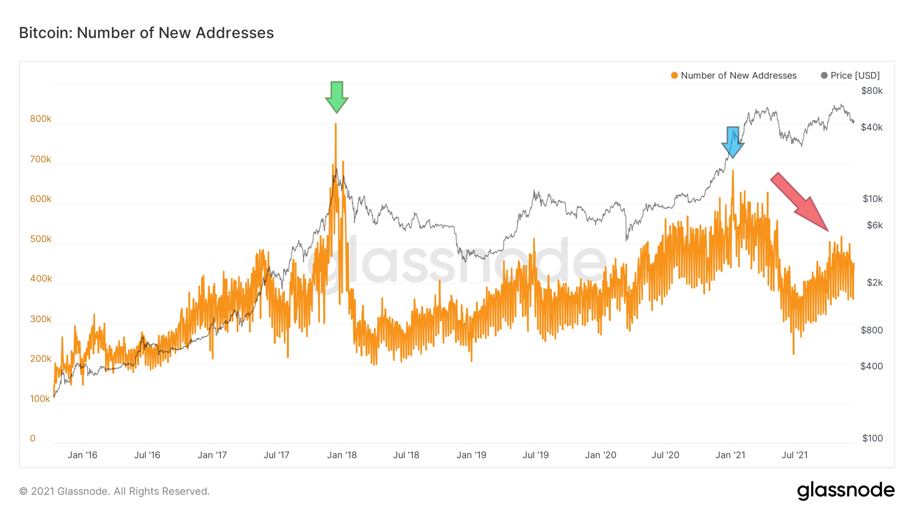
Google Trends is not an indicator of on-chain data but remains consistent. At the beginning of 2016, the graph of the number of new BTC addresses shows a picture that coincides with the aforementioned data. New BTC addresses are the number of unique addresses that appeared for the first time in a Bitcoin network transaction. The indicator is a good approximation of the network’s growth dynamics and the influx of new users.
On the five-year chart, we can see that the peak of new addresses came at the end of the bull market in December 2017 (green arrow). A sharp correction was followed by a long and slow consolidation, which also had local lows and peaks.
The last peak was reached in early January 2021 (blue arrow) after Bitcoin completed a rally from around $10,000 to the then all-time high at $42,000. Since then, a correction has been underway on the new addresses chart (red arrow), despite the BTC price reaching higher levels.
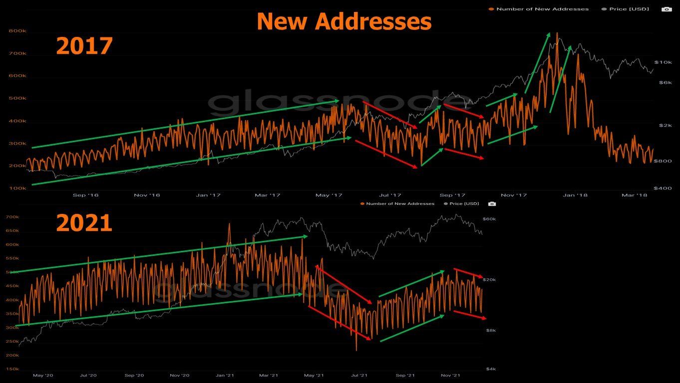
Cryptocurrency market analyst @OnChainCollege found an interesting pattern in this chart. In a recent tweet, he compared the fractals of new addresses from 2017 and 2021. The chart shows that the number of new addresses is lower than when the cycle peak was reached.
He then divided the two graphs into upward and downward sequences. Their similarity suggests that the large influx of new users in this cycle is still to come. Here is how he commented on his interpretation:
“We know this. Retail isn’t here. Nothing new.”
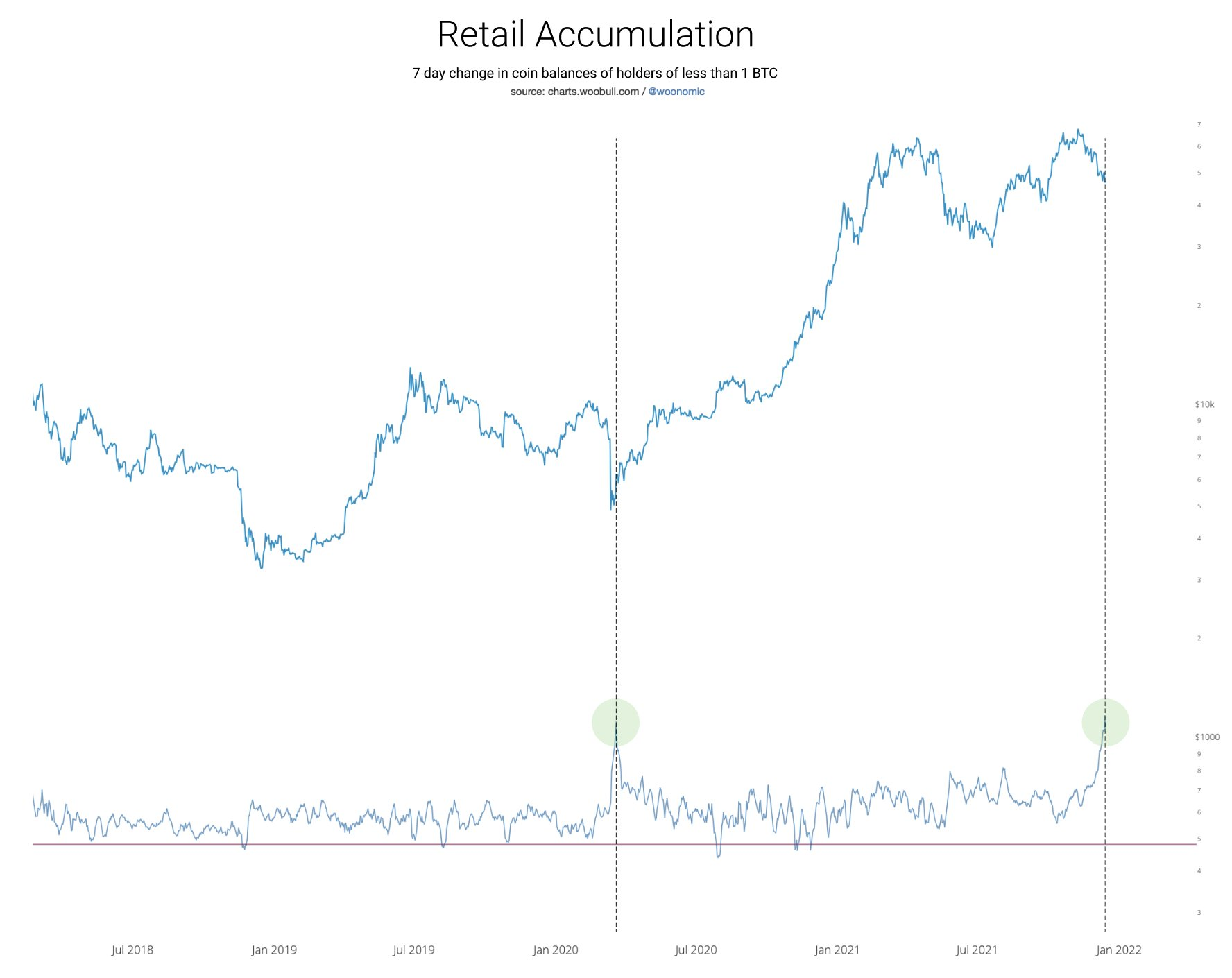
However, in opposition to this claim, well-known on-chain analyst @woonomic tweeted a different chart. It seems to contradict earlier insights about the passive role of individual investors.
In his view:
“The last time retail bought the dip this hard was at the bottom of the COVID crash.”
Decrease in the number of entities in profit
Another on-chain indicator, suggesting that retail is far from FOMO stages is the percentage of entities in profit. The indicator takes into account all entities whose funds were on average bought at prices lower than the current price.
Counting from the all-time high of $69,000 to the current price of Bitcoin, the indicator has seen a decline of around 25%. The intensity of this decline can be compared to the crash that occurred in May.
The percentage of entities in profit nearly reached a bottom at the end of the summer BTC correction (dashed line).
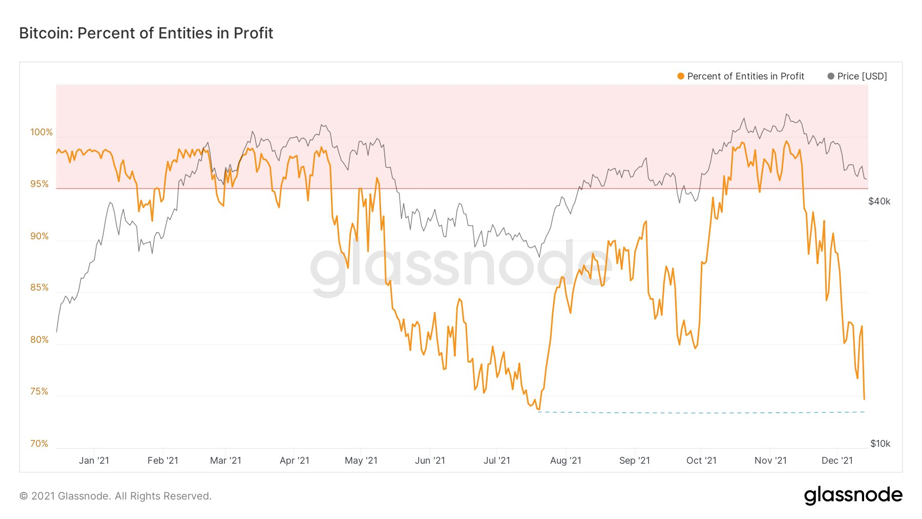
The significant difference is the price of Bitcoin, which fell to $29,000 at its July low. Today, trading in the $46,000 – $49,000 range, it appears that the same percentage of traders are reporting losses.
This divergence was highlighted by analyst @Parabolic_Matt, who compared it to a similar situation in 2020-2021. Bitcoin’s price is rising while the number of entities in profit is falling (yellow lines). When this kind of bullish divergence has occurred in the past, BTC has seen dynamic upside.
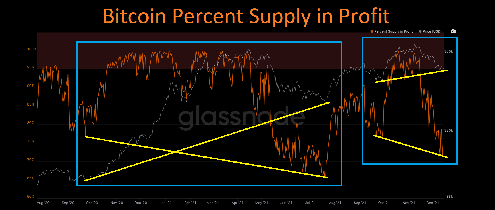
Another way to interpret this divergence is that retail is joining the market. New entities buy the top with hopes, to then capitulate at the bottom and sell at a loss. This leads to another accumulation opportunity for the so-called “smart money” and the start of another wave of upside, where cheap BTC is sold more expensively to the next wave of new market participants.
The moment when the growth of new addresses becomes parabolic and the vast majority of entities are in profit will likely be a strong signal for the peak of this bull market. On-chain data indicates that this is not yet the time.
For BeInCrypto’s latest Bitcoin (BTC) analysis, click here.


