
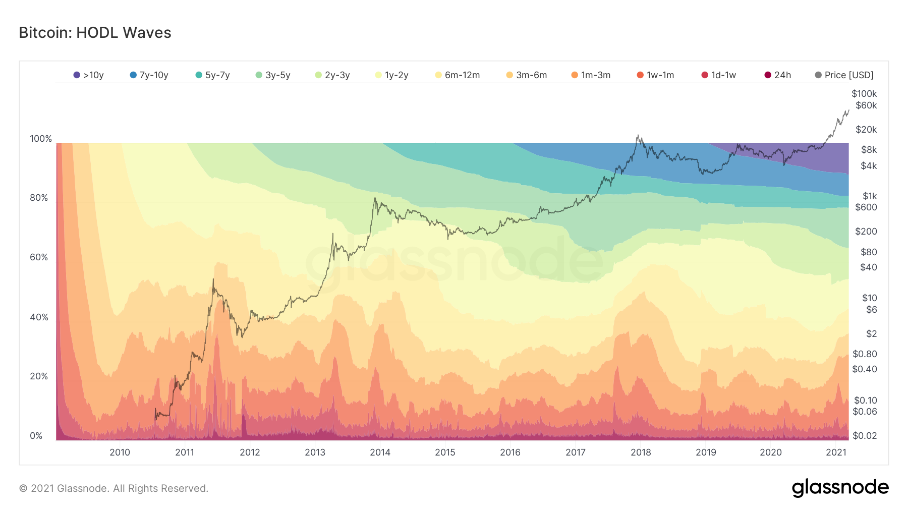
A look at on-chain data, more specifically the HODL wave, outlines the age of coins that are being transacted at certain time periods.
An appropriate measure of the health of the Bitcoin (BTC) market can be observed if we manage to disregard short-term buyers. This puts the main focus on the long-term holders.
The main reason for this is that new buyers usually have less conviction. As a result, their hands are speculative, thus considered weaker.
One method that allows us to take a look at the data in this specific way is to survey the age of the coins being moved. This can be done by observing HODL waves.
HODL Wave
The HODL wave uses different colored bands in order to show the fraction of the existing BTC that was last moved in a chosen time period.
The default color settings are:
- Warm colors represent BTC that has recently transacted – Red, Orange, Yellow
- Cooler colors represent BTC which has not transacted for a while – Light Yellow, Green, Blue
The relationship between the buying and selling of these two groups is crucial. It can be used to determine and analyze the behavior of investors throughout Bitcoin’s market cycles.
As time passes, bands become bigger, which creates what is known as the HODL wave.
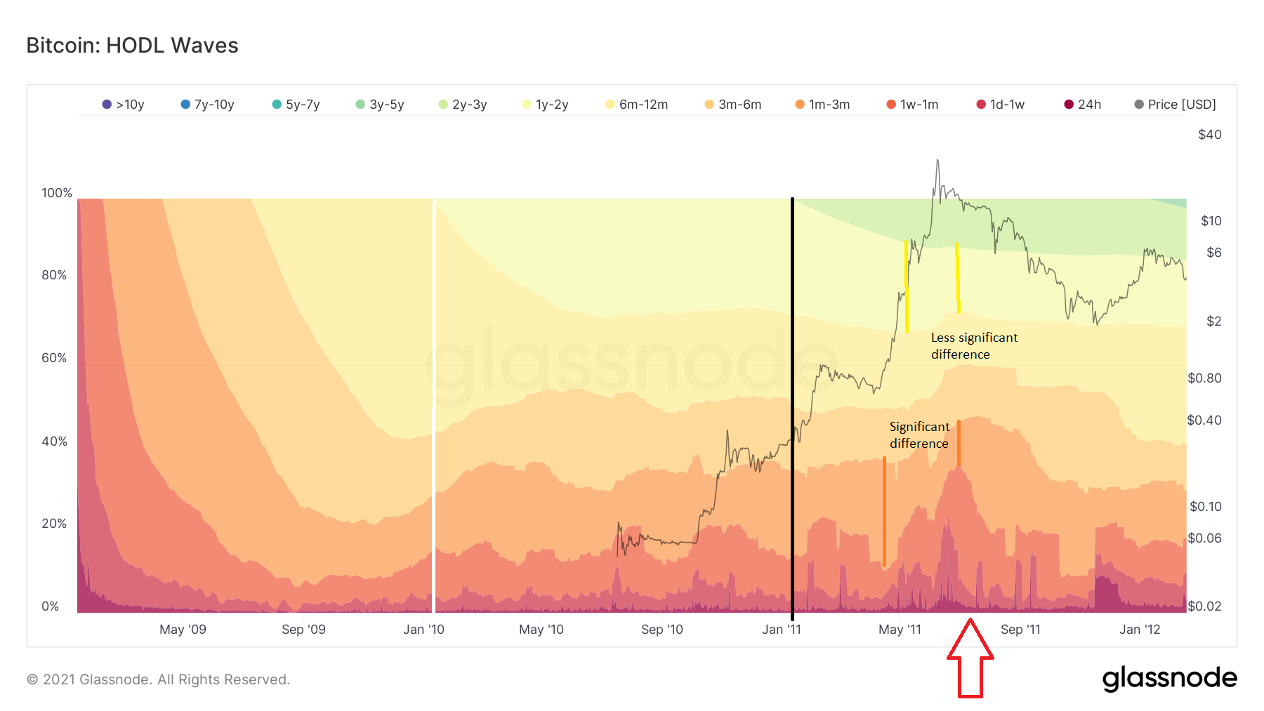
How Bands Are Created
The colors up to and including the yellow wave show BTC that has transacted in the past 12 months. The yellow band represents periods between 6-12 months.
In January 2010, BTC had been around for only one year (white line in the image below). Therefore, all of the BTC in existence was contained inside the bands up to the 6-12 month time period.
However, as time passes, we can see another band beginning to form and becoming larger (white line). The yellow band represents coins that have not moved for more than one year.
HODL Band Shift
As the light orange band becomes smaller, the yellow one becomes larger. This is because holders of the previous 6-12 months are now becoming holders of 1+ years. The same thing happens to the yellow band (black line) once the green band starts to form. The yellow band gets smaller, while the green becomes larger.
When there is a spike in short-term movement, we can analyze which band is shrinking in order to determine who is the culprit for the selling.
This is especially visible in the middle of 2011 (red arrow) when we see a huge spark in the short-term activity. This is denoted by the red colors.
At the peak of the spike, the 1-3 month band (orange) is considerably smaller than it was only three months ago. This means that a significant number of coins that had not moved in the previous 1-3 months are now moving.
During this time, the light orange and the yellow bands decreased considerably less, while the green band barely moved.
Therefore, we can determine that medium-term holders (1-12 months) are doing the most selling, while longer-term holders (1-2 years) are doing significantly less. Holders of 2-3 years are continuing to hold since there is no change in the green bands.
HODL Wave Patterns In The Previous Cycle
A look at the previous market cycles shows one distinct pattern. During tops, short-term activity spikes. This is especially notable in the 1 week-1 month band (red).
In addition, there was a bearish divergence in the 2014 and 2018 tops. Despite the BTC price increasing, there were fewer short-term transactions.
During the 2018 top, the bands that decreased the most were the 2-3 years and 3-5 years bands. Therefore, we can determine that a significant portion of holders between 2-5 years took profit between October and December 2017, with the majority of profit-taking being done in October.
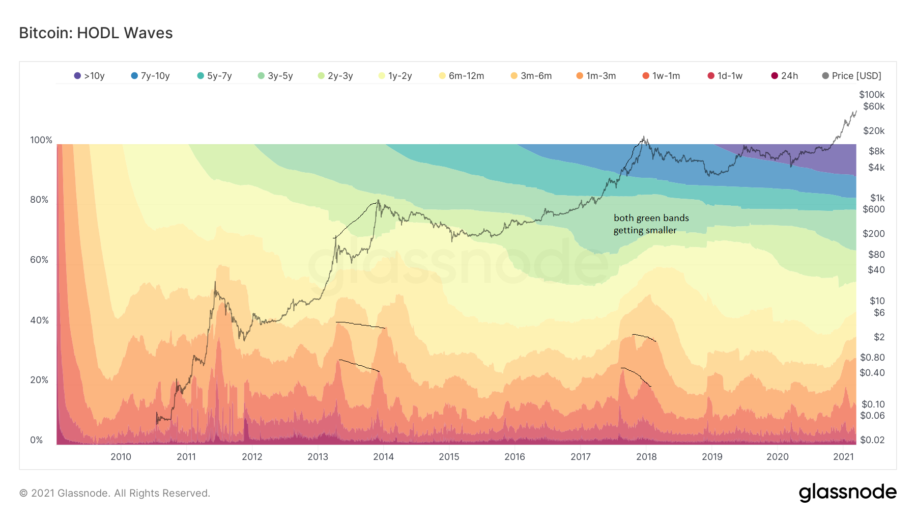
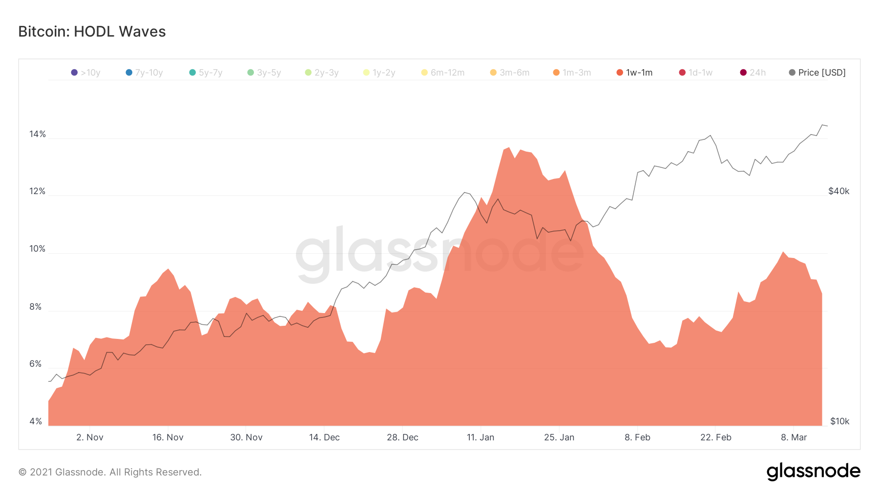
The chart becomes clearer once we remove other bands.
As can be seen below, all the tops until now have been combined with a significant spike in the 1 week-1 month band — between the 15-20% level.
Currently, this band represents around 10% of all BTC transactions.
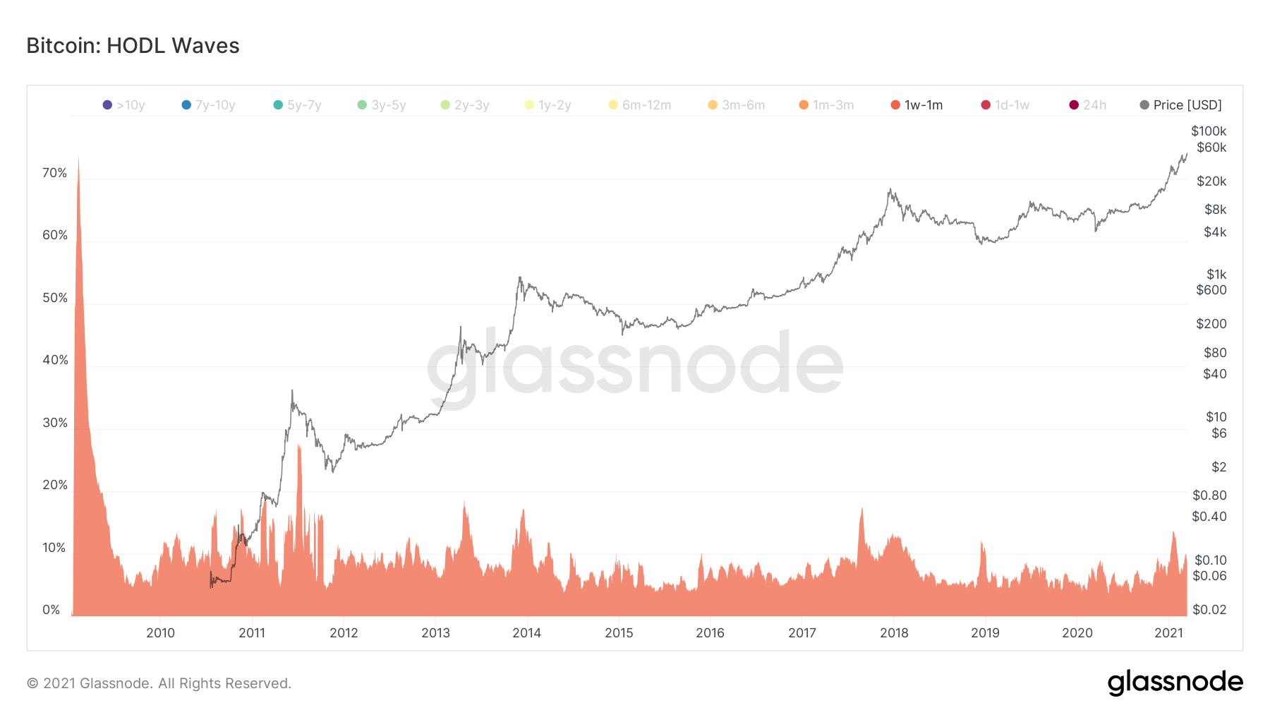
A closer look at the movement this month shows that there was a spike to 14% in January. However, the band is now back below 10%.
Therefore, short-term sellers are not yet doing as much selling as they did in previous tops.
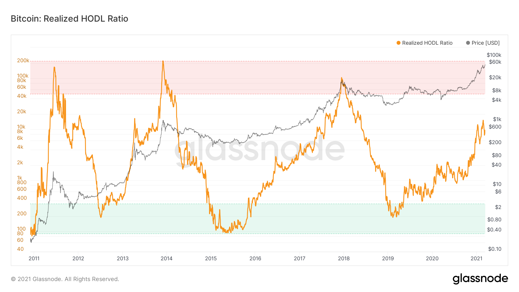
RHODL Ratio
We arrive at the same conclusion when using the Realized HODL Ratio (RHODL Ratio).
This indicator takes a ratio between the 1 week- 1 month and 1-2 year bands. When this ratio increases considerably, it’s usually a sign of an overheated market and potential top.
This is so because when this ratio is high, the amount of BTC that has been transacted in the short-term dwarfs that which has been transacted in the long-term.
As we can see, the RHODL ratio went above 50,000 in June 2011, December 2013, and December 2017. These have been the three major cycle tops up to this point.
Currently, the RHODL ratio is at 10,000, suggesting that conditions are not yet ripe for a significant market top.
Conclusion
We can look at the time periods in which BTC has been transacted in order to determine potential market tops. One indicator that displays this data is the HODL wave.
When looking at this data, we find out that the current ratio between short- and long-term sellers is dissimilar to that in the 2011, 2013, and 2017 tops.
Therefore, it’s possible that the market will continue overheating with short-term buyers before an eventual top is reached.
For BeInCrypto’s latest Bitcoin (BTC) analysis, click here.
