


Bitcoin (BTC), like most cryptocurrencies, has been subject to high volatility since its inception. It is because of its potentially high ROI that it has earned a reputation as a great investment. At the same time, it remains a risk-on asset, as it regularly loses 75-85% of its value during cyclical bear markets.
Data released yesterday by @ecoinometrics provides new insights into Bitcoin volatility. Contrary to popular perceptions, BTC volatility is as much for bulls as it is for bears. Figuratively, this shows that Bitcoin is symmetrical, with its best and worst days usually balancing each other out.
Bitcoin and Its Symmetrical Volatility
A chart published on Twitter shows Bitcoin’s 10 best and worst trading days of each year since 2013. The horizontal scale ranges from -40% to +40% of daily profits or losses. The vertical scale, on the other hand, is consecutive years ordered from the bottom up.
Read More: Bitcoin (BTC) Price Prediction
The blue dots mark the days when Bitcoin generated the lowest profits, i.e. experienced the largest daily decline. The further the dot is to the left, the deeper the decline was. Red dots, on the other hand, represent the days in which Bitcoin made the most profits, i.e. increased the most on a daily basis. Naturally, the further to the right, the greater the profits were.
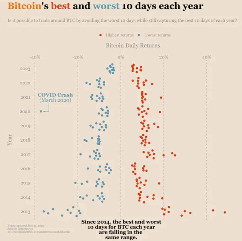
The first thing that catches the eye, after looking at the chart, is its symmetrical shape. It somewhat resembles the shape of a Christmas tree or a Coca-Cola bottle with a wide bottom. The obvious interpretation of such a distribution of points is diminishing volatility. This applies to both potential profits and losses.
In general, in each successive year the range of deviations from the median of 0% is smaller. However, this is not a monotonic decline, as there are sometimes years that are more volatile than previous years.
A positive example of increased returns can be seen in 2017, in which the red dots crossed the +20% mark several times. This did not happen once in 2014-2016. In contrast, a negative example is 2022, where the negative volatility was higher than for the entire 2019-2021 period.
Of course, both 2017 and 2022 are not coincidental. They remain closely linked to Bitcoin’s 4-year halving cycles. 2017 was the second exponential part of the bull market, which led to the historic all-time high (ATH) of nearly $20,000. In contrast, 2022 was the latest cryptocurrency winter. It was the worst since 2018 and led BTC to drop 77%.
Local Volatility vs. Global Symmetry
Despite these local imbalances, the entire chart of Bitcoin’s 10 best and worst days of the past 10 years remains roughly symmetrical. This leads to two main conclusions:
Bitcoin remains an attractive asset for traders due to its equally high volatility for long (upside) and short (downside) positions.
BTC volatility decreases over time as the market capitalization becomes larger. More and more capital is required to move the market, so over time the Bitcoin market will likely resemble traditional financial markets.
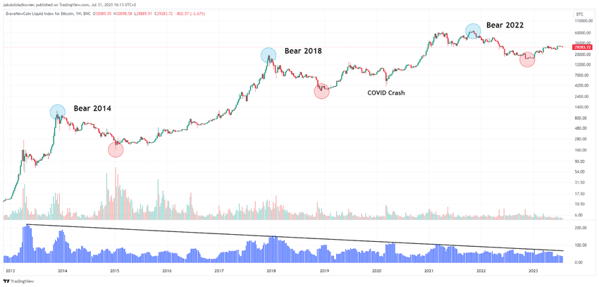
The latter conclusion is well illustrated by Bitcoin’s long-term chart on a logarithmic scale and the associated Historical Volatility (HV) indicator. Past cycles have most often been characterized by maximum volatility during the end of a bull market and high volatility during the end of a bear market.
Despite this, the blue HV chart is in a clear downtrend. Its increasingly lower peaks are following the descending resistance line (black). This suggests that despite the still ongoing 4-year halving cycle, BTC volatility is declining.
Extreme Values and a Black Swan
The declining volatility can be seen by simply comparing the volatility from the first years of Bitcon’s listing with the current one. In the chart by @ecoinometrics, the Christmas tree shape suggests that the more mature BTC is as an asset, the lower volatility is to be expected.
For example, 9 of the top 10 days in 2013 produced returns of >20%. However, during the 2017 bull market, these were only 3 out of 10 days. Since then – that is, for 5.5 years – no trading day has led to 20% Bitcoin returns.
The same is true of the worst days. Here, since 2015, no trading day has led to a drop of more than -20%. The only exception remains the black swan of March 2020, when Bitcoin – like many other traditional assets – experienced a deep decline of almost 40%.
For BeInCrypto’s latest crypto market analysis, click here.


